Ultimately people want to share the analysis of their survey results.
We aim to empower our customers to customize their results, allowing them to add images, text, and control data placement as they see fit.

Create a report of your results and insights
Role: Lead Product Designer
Project: Analyze Reporting
Company: SurveyMonkey
Background
SurveyMonkey's shared results page was unmodifiable. Feedback indicated that allowing users to add logos, text, or brand colors would greatly benefit our customers.
I embraced the "Explorer vs. Presenter" modes from data visualization to enhance user experience empathy.
I utilized our own personas, from advanced data-savvy users to regular app users less familiar with data, to inform the exploration and discovery phases.

Using three low-fidelity prototypes, we gauged customer perspectives on crafting insights reports post-exploratory data analysis.
Approach A: Clean slate

Approach B: Do it yourself

Approach C: Do it for me
Design Studio Workshop
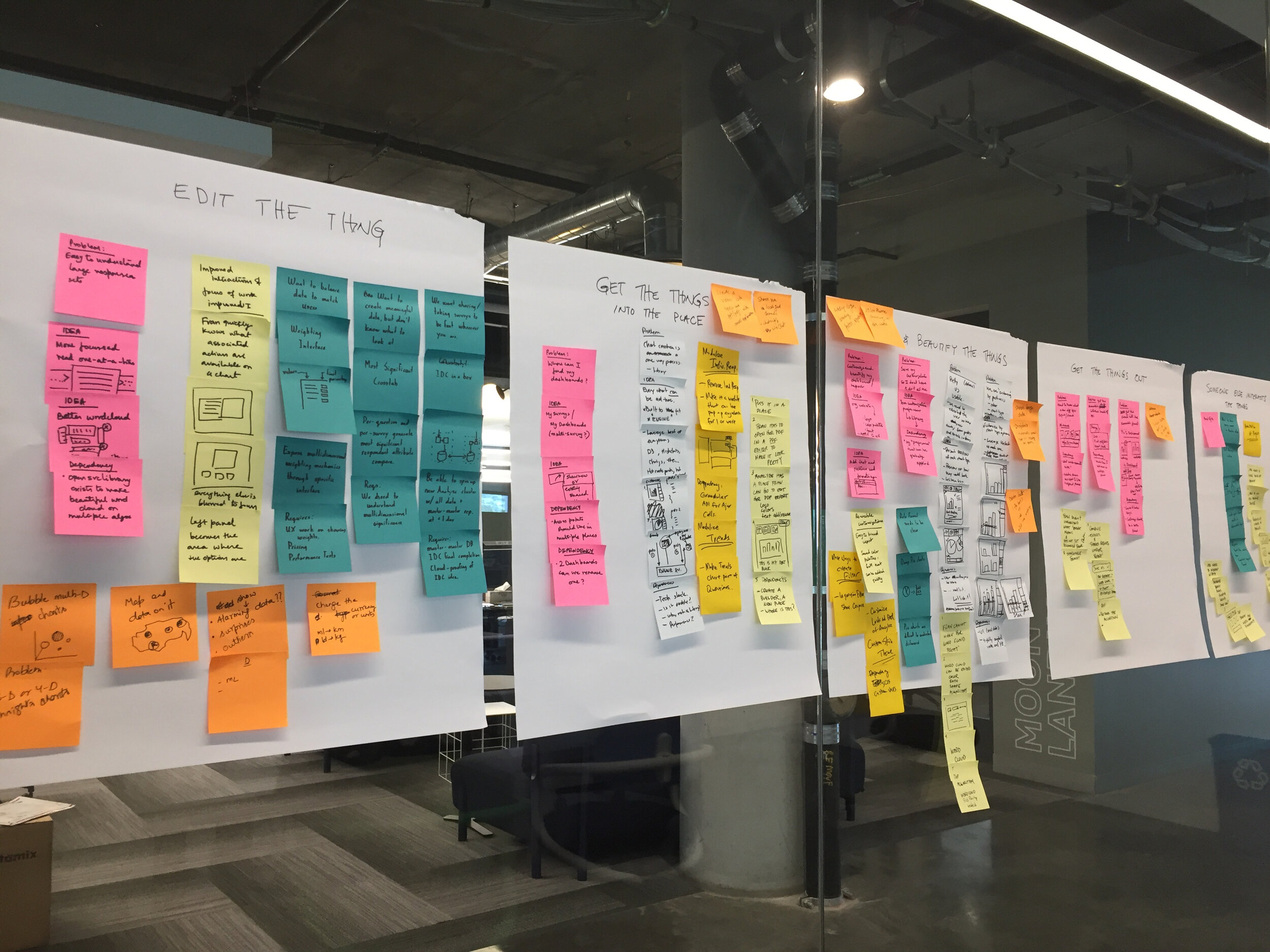
I led a series of workshops with everyone on the Analyze team to diverge on the explorations thus far, and to generate a large number of ideas that would inform design iterations.

Motion study: focus interaction (with Michael Dulin, Motion Designer)The concept for a drill-down pattern, “Fast Focus”, was later inducted into the Design System.
A notable result of the workshop was an interaction pattern that would allow the user to drill down into a chart for a more focused experience with the data.
Once we converged, I prototyped the high-fidelity user journey from creating to publishing and receiving a shared report.
Together with my User Research partner we conducted a remote test to gauge user expectations on report creation, customization, sharing, access, and naming conventions.

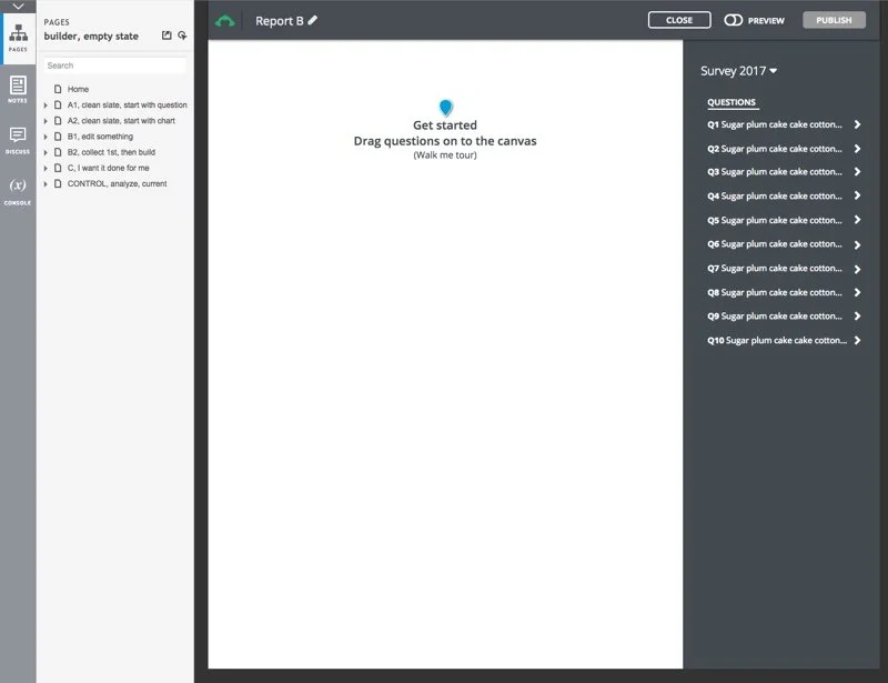
User journey for creating a results dashboardUser research further guided me to refine my strategy.
The all new presentation experience allows customers to customize their data and insights into a results dashboard report.

Annotating your data insights is easy now! Just create a new text card in your dashboard report.


Multiple motion studies informed how the grid of cards should behave within the builder (with Michael Dulin, Motion Designer).

UI study to inform the builder canvas micro tools.
An entirely new set of tooling needed to be designed in addition to the higher level user journey.
Toolbar visual designs were polished.
Once we landed on the right scope of builder canvas tools, new iconography and interaction states were finalized (with Jonathan Howell, Visual Designer).

It’s time to publish.
Once a user has completed their dashboard report they have the option to publish and share it out.

