Online and Unmasked: The Evolution of Digital Human Identity
In today's tech-driven world with AI and the data economy on the horizon, let's dive into the fascinating topic of human identity. Think of it as a colorful tapestry made up of memories, relationships, values, and all the roles we play in life. But with so much of our life played out online, to what extent are we taking account of our digital identities? Some folks are actively aware of the weight of their digital presence, while others are passive participants sleepwalking through those login and authorization patterns without any sense of their digital agency. Imagine if we could own and control it, sparking self-awareness. We'd refine our online manners and ethics, paving the way for a more conscious and empowered digital self.

In light of the profound shifts driven by emerging technologies such as AI, quantum computing, and the data economy, I have found myself delving deeper into the intricate concept of human identity. These forces have sparked intriguing speculations about the future of our identity as individuals. However, before exploring the broader questions, it is essential to begin with a fundamental inquiry: What defines our core identity as human beings?
Understanding our human identity
In the realm of psychology, the notion of human identity is recognized as intricately woven and multifaceted. It comprises a rich tapestry of elements, including memories, life experiences, interpersonal relationships, personal values, external attributes, political convictions, and beyond. This underscores the complexity of navigating a diverse spectrum of interwoven components involved in comprehending one's identity.
Indeed, as individuals, we often embody a multitude of roles and affiliations that collectively shape our overarching identity. These roles can encompass being a child, friend, partner, parent, professional, and citizen, among others. Moreover, as we navigate these diverse identities, they may evolve in response to varying contexts or life stages.
Recognizing this multiplicity of roles and affiliations is pivotal in grasping the intricacies inherent in human identity. However, it's worth noting that the extent of our awareness and the degree to which we consciously contemplate these identities can vary significantly among individuals.
Conscious recognition vs unconscious integration
Some individuals possess a keen awareness of their multiple identities and proactively manage and navigate these roles in diverse contexts. They engage in conscious reflection, considering how they present themselves within each role and how these roles intersect. This can be termed 'conscious recognition.' In contrast, for some, there's an 'unconscious integration' wherein multiple identities seamlessly blend into their daily lives to the extent that they don't consciously perceive them as distinct roles. Instead, they effortlessly adapt and adjust their behavior based on the situation, often without explicit recognition.
How mindful are we of our digital identity?
It's arguable that, for many of us, our digital identity has become an unconscious integration into our lives. While we may possess a contextual awareness of being online in specific situations, do we truly appreciate the significance of our online identity beyond the routine engagements of inputting login details and completing tasks digitally?
At present, a significant portion of our online identity revolves around authorization patterns that we often overlook as routine steps when logging in or signing up for various services. Privacy, though a highly debated concern, sometimes appears to be overshadowed by excessively long and unread terms and conditions agreements. Moreover, the recent proliferation of seemingly endless cookie settings prompts reflection on how many individuals are aware of the option to tailor these settings for enhanced control over their online experiences.
We are frequently exposed to headlines cautioning us about the perils of the attention economy and the fact that corporate giants control our data. However, these concepts often feel abstract and leave us with a sense of indifference. It's challenging to discern our role in the elaborate online dynamics where we willingly opt-in, and engage with services we believe provide value, yet we continuously get caught up in a cycle of dopamine-fueled responses, all while algorithms incentivize our interactions through our comments and posts.
Taking accountability for our data
The concept of our digital identity remains somewhat ambiguous because we have limited ownership of our online activities. This raises the question: What if we were empowered to own our online experiences? If we were given the opportunity to take control of our data and potentially participate in the data economy by selling it ourselves, how might this reshape our self-perception? It might necessitate a shift towards a more deliberate recognition of our digital identity, fostering a sense of accountability for our data, as opposed to the current passive or captive stance wherein large corporations are the ones profiting from the sale of our personal information.
The shift in our digital identity towards greater ownership and control of our online data could prompt psychological exploration thus igniting greater conscious recognition of a digital identity with rights and earning potential. This self-exploration might take a myriad of forms such as:
Data as a mirror: Seeing your online data as a reflection of your interests, behaviors, and preferences may encourage you to delve deeper into understanding yourself. You may question why you engage in certain online behaviors and how these align with your core values and beliefs.
Personal Data Management: Owning and managing one's digital data might necessitate a deliberate process of evaluating what data to keep, share, or sell. This decision-making process could lead to introspection about the value you place on different aspects of your online identity.
Privacy and Boundaries: The shift towards greater ownership of data may lead you to consider your boundaries in the digital realm. You may reflect on what information you are comfortable sharing and how your online presence aligns with your desire for privacy.
Stripping away the anonymity: fostering respect on the internet
These explorations hold the potential to profoundly influence our online norms and practices, both on an individual and societal scale. As individuals embrace the role of active participants in the data economy, they are likely to contemplate the implications of this newfound agency on their digital identity. This introspection may extend to a deeper consideration of the ethics governing their online conduct and behavior, rooted in their digital principles and value system. This shift, from passive participants to active custodians of our digital selves, could spark heightened self-awareness.
Should we embark on this digital self-discovery journey, we scrutinize our online activities, evaluate choices, and consider how they align with our values. We ponder privacy boundaries and the ethical implications of how we take ownership and accountability of our data. This newfound sense of agency over our digital identities may foster a more deliberate approach to online interactions, potentially giving rise to a more refined digital etiquette and unexplored financial advantages that most of us have yet to fully grasp.
Future-Focused: Integrating Speculative Design
Speculative Design is a forward-thinking approach that challenges assumptions and sparks critical thinking. It uses storytelling, prototyping, and visualization to explore alternative futures and provoke discussions on the social, cultural, and ethical implications of technology and innovation. It has gained popularity across various fields, including art, architecture, product design, and technology. By embracing a speculative mindset, considering long-term implications, and engaging in reflective practices, Speculative Design offers a powerful tool for envisioning and shaping a more thoughtful and imaginative future.

The Blah Generator by Me+MidJourney
Speculative Design has gained popularity in recent years as a way to explore possible futures and challenge our assumptions about the world. It’s a forward-thinking approach that uses design principles and techniques to explore and question potential future scenarios. It goes beyond traditional problem-solving and focuses on imagining alternative futures, challenging assumptions, and sparking critical thinking. It's important to note the difference though between prediction and speculation. Prediction is based on existing trends and data, whereas speculation is more open-ended and creative.
Who’s doing it?
Speculative designers employ storytelling, prototyping, and visualization to create artifacts and narratives that provoke discussions about the social, cultural, and ethical implications of technology and innovation. It can be found in various fields, including art, architecture, product design, and technology. Examples include the “Social Cooling" project by Tijmen Schep, or Tellart's work for the World Government Summit in Dubai. Another well-known example is the "Google Glass" project by Google which might serve now as more of a cautionary tale for how not to transition from Speculative Design to product design and development.
Is it art?
Speculative Design is being used in art to explore and comment on social, cultural, and political issues. Also referred to as speculative art, it often creates imagined futures or alternate realities that challenge the viewer's assumptions about the world. It can take many forms, including installations, videos, performances, and even virtual reality experiences.
For example, artist Trevor Paglen uses Speculative Design to explore the relationship between technology and power, imagining alternative futures where technology is used to create new forms of oppression. Artist and designer Anab Jain, through her studio Superflux, creates Speculative Design projects that explore the social and cultural implications of emerging technologies.
The theory
The introduction to the theory involves understanding its core principles and methodologies. It encourages designers to adopt a mindset that embraces ambiguity, and navigates the uncertainties of the future. Here are some key concepts to get started:
Names play a significant role and are crucial in projects, conveying intentions and sparking curiosity. They serve as a strategic tool to stimulate imagination and engage viewers in exploring potential possibilities.
Amara's Law is a principle often referred to that states that we tend to overestimate the short-term impacts of technology while underestimating its long-term consequences. It reminds us to take a critical and holistic perspective when considering the effects of technological advancements, emphasizing the importance of considering broader societal and ethical implications.
Future cones, also known as future cones of plausibility or possibility, illustrate the range of potential future outcomes. They represent the diverging paths that the future could take based on various factors, such as technological developments, social changes, and policy decisions. They help us understand that there are multiple possible futures and encourage us to actively shape the trajectory towards more desirable outcomes.
Another important concept is diegetic prototyping, which is the idea of using fictional objects and scenarios to explore the implications of new technologies. For example, you could create a movie or a video game that imagines a future where a new technology is ubiquitous. This can be a powerful way to start conversations and spark discussions about the future.
The mindset
By incorporating speculative thinking into the design process, practitioners can uncover hidden assumptions, challenge existing paradigms, and envision more inclusive and sustainable futures. Here’s a breakdown of some of these concepts:
Exploration of Alternative Scenarios: Expand ideation beyond the status quo and challenge conventional wisdom by offering a valuable avenue for exploring alternative scenarios and envisioning potential futures.
Overcoming Cognitive Biases: Encourage ourselves to question assumptions, entertain unconventional possibilities, and consider a broader range of options to avoid limiting our imagination and problem-solving capabilities.
Anticipating Future Challenges: Anticipate and prepare for future challenges by considering potential risks, technological advancements, and societal changes. Then we can proactively address emerging issues and develop robust strategies.
Innovation and Creativity: Identify new opportunities, and generate novel solutions to complex problems that inspire breakthroughs and drive positive change.
Ethical and Moral Implications: Address ethical dilemmas, identify potential harms, and design systems and technologies that align with our values.
Long-Term Thinking: Longer-term thinking and planning are encouraged so that we can consider the consequences of our actions and decisions, empowering us to make choices that create sustainable and desirable futures.
The process
The overall process of Speculative Design involves several key steps that align with existing design processes while introducing new time horizons and considerations. Here's an overview of the steps and their relationship with traditional design approaches:
Research and contextual understanding: Begin with thorough research and gain a deep understanding of the context, including social, cultural, technological, and environmental factors. This stage is similar to traditional design processes, where gathering insights and conducting user research inform the subsequent steps.
Speculative ideation and concept development: Speculative Design diverges from traditional design processes at this stage. Generate ideas and concepts that now explore alternative possibilities and challenge existing norms. You are encouraged to think beyond the immediate constraints and embrace imaginative thinking.
Prototyping and visualization: Like traditional design processes, utilize prototyping and visualization techniques to bring your speculative ideas to life. This can involve creating physical or digital prototypes, visual representations, or immersive experiences that help communicate and engage stakeholders in the envisioned future scenarios.
Storytelling and narratives: There’s a strong emphasis on storytelling and narratives as a means to evoke emotions, provoke discussions, and create compelling visions of the future. By crafting narratives around your speculative concepts, you can effectively communicate the intended impact and implications of your proposed ideas.
Engagement and feedback: Similar to traditional design processes, engage stakeholders and gather feedback to iterate and refine the speculative concepts. This feedback loop helps shape and improve the speculative ideas, ensuring they align with the needs, values, and aspirations of the intended audience.
Reflection and critical evaluation: Critically evaluate throughout the process. Designers and stakeholders reflect on the implications, ethics, and unintended consequences of their speculative ideas. This introspection helps refine and align the concepts with broader societal and ethical considerations.
Speculative Design offers a fascinating and creative approach to envisioning and influencing the future.
Designers are now empowered to anticipate and shape the trajectory of future developments by emphasizing longer-term implications and new time horizons.
As a valuable tool in art, Speculative Design allows artists to create thought-provoking works that engage audiences in imagining and questioning the future.
By integrating Speculative Design into your practice you can develop long-term strategies to enrich your understanding of societal dimensions, foster innovation, and address ethics that can lead to impactful, future-oriented design outcomes.
Everything I learned about AI Gen just got blown out of the water
March 2023 has been an intense month for text AI generation with several significant releases and announcements. Google unveiled AI functionality for its workspace tools, and GPT-4 was released. Microsoft introduced 365 co-pilot and business chat, and Adobe presented Firefly, which brings text-to-image generation to Photoshop. Additionally, NVIDIA announced a new GPU, H100 NVL, for large-language-model inference, and NVIDIA DGX Cloud, bringing NVIDIA DGX AI supercomputers to every company. OpenAI also introduced support for plugins in Chat GPT, highlighting its accessibility and versatility.
March mAIdness 2023, is a month when everything changed as far as text AI Generation goes. Everything I knew to comment about even last month looks and feels old and redundant.
Honestly, I’m afraid to write this article for fear it will seem tired in a matter of days. Do I have this right? Microsoft just gave Google a run for its money? People are vying to get their hands on Bing Copilot (Bing!?) and Google’s Bard seems like it was pushed out before it was ready to compete.
Let’s break down THE most dizzying 10 days in March that would appear to make tech history if not in the top tech tipping points in a lifetime. Thanks to Matt Wolf’s YouTube channel at least I can hold on to something to catch my breath before the next round of announcements.
March 13th - 17th
AI's Most Insane Week - Things Will Never Be The Same (14min)
On Monday, Stanford introduced the Alpaca 7B model, which is much more lightweight than similar models and can be used on a local computer.
On Tuesday, Google announced AI functionality for its workspace tools
as well as the release of the Palm API to select developers.
That same day, GPT-4 was released
… and Microsoft confirmed that it had been using an early version of the model in Bing for the last five weeks.
Wednesday saw the launch of Midjourney version 5, which can generate more realistic images.
On Thursday, Microsoft announced its 365 co-pilot and business chat.
Microsoft's AI Future of Work Event in 8 Minutes (8min version of the full one below)
The Future of Work With AI - Microsoft March 2023 Event (36min, but worth every sizzle reel moment)
In addition, Baidu released its chatbot, Ernie, but the presentation was underwhelming.
More significant announcements are expected at next week's Nvidia GTC event.
March 20th - 24th
Another Massive Week in AI! (Summed Up in 10-Min)
A Massive Upgrade To ChatGPT! (This is Crazy) (15min)
On Tuesday Google opened the Bard waitlist, giving quick access to those who signed up.
Also on Tuesday, Nvidia CEO Jensen Huang kicked off the NVIDIA GPU Technology Conference (GTC) with his keynote presentation unveiling the company's latest AI innovations
a new GPU, H100 NVL, for large-language-model inference, which can reduce processing costs by up to 10 times.
Huang also unveiled NVIDIA DGX Cloud, a service that will bring NVIDIA DGX AI supercomputers to every company
… as well as NVIDIA AI Foundations, a cloud service for customers needing to build, refine and operate custom LLMs and generative AI.
this new technology will allow businesses to create their own large language models using Nvidia's cloud computers and GPUs.
This means that companies can train their own AI chatbots and develop their own models without needing a supercomputer, as they can run them on Nvidia's computers.
NVIDIA is also partnering with Microsoft to bring NVIDIA Omniverse Cloud, a fully managed cloud service, to hundreds of millions of Microsoft 365 and Azure users.
On Tuesday, Adobe demoed Firefly which brings text-to-image generation to Photoshop and is currently in the beta stage. Adobe is treading carefully in this space as far as copyright infringement and is using the beta process to engage with the creative community and customers.
Also on Tuesday, Microsoft released text-to-image generation within Bing chat using DALLE, leaving people wondering if it's the next-gen version of DALLE. This feature is accessible to anyone inside of Bing chat and can generate images by simply typing a description.
As of Wednesday the Opera browser has integrated AI features such as ChatGPT and ChatSonic that allows users to summarize, rewrite and change the tone of voice for a selection of output text.
Also on Wednesday Microsoft announces Microsoft Loop, an AI-powered tool that is similar to Notion, with AI features built-in. Loop will integrate with other Microsoft tools like Excel, Word, and PowerPoint.
On Wednesday Canva rolled a ton of AI into their platform like a new Brand Hub, which provides tools to help users remain consistent with their organizations' visual identity. The Canva Visual Worksuite will also include an AI-powered "Magic Design" tool, a copywriting assistant, a translation feature, and a tool that generates entire branded presentations - basically all the AI things.
GitHub announced Copilot X on Wednesday, which is an AI-powered code helper that uses GPT-4 to help coders solve their problems and fix their code. It even has a voice interface to make it easier for coders to communicate with it.
Also on Wednesday, Ubisoft uses AI to auto-generate dialogue for non-playable game characters, speeding up game development process.
Now to Thursday, when Unreal Engine demoed the new version of metahuman at GDC, which enables realistic character creation from iPhone videos.
On Thursday OpenAI announced support for plugins in Chat GPT, enabling users to extend the functionality of the language model by adding additional tools like browsing the internet, calculating complex calculations, editing images and videos, and connecting to other tools like Zapier.
OpenAI has also open-sourced the code for the knowledge base retrieval plugin, allowing others to create their own plugins for their knowledge bases. This move could pose a challenge for other GPT-3-based companies that lack web connectivity and highlights Chat GPT's accessibility and versatility.
From ambiguity to clarity: how IDEO's course prepared me to lead complex projects
My experience with IDEO's Leading Complex Projects course provided valuable insights and practical advice for leaders looking to navigate complex project environments with confidence and clarity. By adopting a mindset that balances intuition with rational analysis, developing a flexible and adaptable approach, building collaborative relationships, and aligning around a clear purpose, leaders can effectively navigate uncertainties and succeed in complex project environments.

In today's fast-paced and ever-evolving business world, leading complex projects can be a daunting challenge. Ambiguity, uncertainty, and unforeseen obstacles can arise at any moment, making it difficult to navigate and succeed in such a dynamic environment. However, by exploring complexity, enabling outcomes, designing alignment, leveraging intuition, and building resilience, leaders can effectively prepare themselves to tackle the toughest of challenges. In this blog post, we will explore how IDEO's Leading Complex Projects course helped me gain a deeper understanding of these five key themes, and how they can be applied to successfully lead complex projects with confidence and clarity.
Exploring Complexity
The concept of complexity can be framed as people plus uncertainty. We often find ourselves in situations where there are multiple individuals or groups with diverse perspectives and needs, and where the outcome of the project is uncertain or difficult to predict. Successfully managing complex projects requires a unique mindset that balances intuition with rational analysis. This mindset includes various strategies and approaches that can be adopted and experimented with. I found myself digging deeper to understand the circumstances under which I tend to resist being as flexible and adaptable. By exploring this framework of complexity I uncovered ways in which I was could adjust my strategies in response to changing circumstances and feedback from team members.
Enable Outcomes
Enabling outcomes requires knowing the purpose of the project as it allows for defining success. The purpose of the project serves as a lighthouse in the storm and guides the team through uncertainties. A clear purpose leads to successful outcomes and enables better alignment among team members. Having a shared drive also helps in building a sense of community and shared ownership among team members, leading to better collaboration and increased engagement toward achieving project goals.
Guiding principles
Guiding principles can provide a wayfinding framework and create space for more flexibility during times of uncertainty. It can be counterintuitive to loosen control when the natural reaction is to maintain it in complex situations. Principles that are flexible enough to adapt to changing circumstances but still provide a clear direction for the project can serve as a reference point and provide a sense of stability amid chaos. Note that principles should not be mistaken for a project purpose statement. For example, stating that you want to make a user journey simpler is not a purpose statement, but simplicity is an excellent design guideline that can be applied to whatever your project goal is.
There are a number of good guidelines for establishing team principle. Some key characteristics of a good guideline principle include:
Relevant: The principle should be directly relevant to the project and aligned with its overall purpose and goals.
Clear: The principle should be easy to understand and communicate clearly to all team members involved.
Measurable: The principle should be measurable so that progress towards achieving it can be tracked and evaluated.
Realistic: The principle should be achievable given the resources and constraints of the project.
Flexible: The principle should allow for flexibility in adapting to changing circumstances and new information that may arise during the course of the project.
Inclusive: The principle should be inclusive, taking into account the perspectives and needs of all team members involved.
Actionable: The principle should be actionable, providing a clear course of action for team members to follow in achieving the desired outcome.
Design Alignment
Collective knowing
Collective knowing refers to the shared understanding and knowledge that emerges from collaborative efforts and interactions between individuals in a group or team. The process of collective knowing involves active listening, respect for diverse perspectives, and a willingness to engage in constructive dialogue to arrive at a shared understanding. There are helpful tools and activities you can leverage to start moving the team toward alignment. One such activity I was introduced to is mapping the system.
System mapping
A system map is a visual representation of a complex system that illustrates the relationships and interactions between its various components. They can be created using a variety of methods, including pen and paper, sticky notes, or digital tools.
To create a map of a complex project, you can start by identifying the key stakeholders involved as nodes, and then mapping out the relationships and connections between them. This can be done by drawing connecting lines that indicate the strength of the connection, whether it's strong, weak, or non-existent. You can also use different colors or symbols to represent different types of relationships, such as partnerships, conflicts, or dependencies.
To make the map more comprehensive, you can also include other elements, such as timelines, milestones, and external factors that may impact the project. By creating a visual representation of the project's system map, you can better understand the complexities of the project, identify potential challenges, and explore opportunities for improvement. This can be a valuable tool for designing alignment between people, relationships and purpose.
Leverage Intuition
Many of us have been conditioned to believe that intuition is not a reliable or rigorous enough approach to use in business. As a result, we may have repressed our intuitive abilities, relying solely on rational analysis and data-driven decision-making. However, research has shown that intuition can be a valuable tool for leaders, especially in complex and uncertain situations where data may be incomplete or ambiguous.
Like all ideas, intuition should be tested and validated through feedback. Seeking feedback from others can help to evaluate intuitive insights and identify potential biases or blind spots. By listening to different perspectives and incorporating feedback we can absolutely leverage our intuition to help make informed choices and avoid potential pitfalls. It's important to recognize that intuition is not infallible and should always be considered in conjunction with other inputs to ensure the best possible outcome.
Takeaway
I was pleasantly surprised if not relieved how this IDEO course, Leading Complex Projects, applied instantly and directly to what was going on in my own job. The 5-week course emphasizes the importance of balancing intuition with rational analysis and feedback from others. By developing a flexible and adaptable mindset, you are better equipped to adjust your strategies and approaches in response to new information and changing dynamics. The course also provides tools and techniques for building collaborative relationships among team members and aligning around a clear purpose to enable successful outcomes. Through this course, individuals can learn to lead complex projects with confidence and navigate uncertainty with intuition combined with strategic thinking.
The power of ChatGPT prompts: best practices for effective content generation
In this blog post, I share my insights on creating effective prompts for optimal AI-generated text outputs, specifically in the realm of marketing. I highlight the importance of maintaining control and guiding the AI to assist you, rather than the other way around. The importance of using commands and providing context is highlighted so you can tell the AI exactly what you want by experimenting with formulas for creating effective prompts. Actively tweaking the context by observing the output is crucial when working with AI.
Working at Jasper AI has provided me with invaluable insights into the process of creating effective prompts to achieve optimal AI-generated text outputs, particularly in the realm of marketing. However, the best practices that I have learned so far are not limited to marketing alone, as they can be applied to a wide range of topics.
It’s still your job
It is important to remember not to relinquish complete control to tools like ChatGPT as if you are no longer the one steering the ship. This may be tempting, especially in the early stages of working with AI-generated text, as it can be difficult to discern where your role ends and the AI's begins. However, it is crucial to maintain a reliable workflow that guides the AI to assist you, rather than the other way around. In other words, you should be the one directing and supervising the AI-generated text, not the other way around.
In this post, I’ll be sharing my insights gained through recent immersion in the AI text-to-text and text-to-image generation space. However, it is important to note that breakthroughs and new releases in this field are happening at a rapid pace, so my learnings will likely only scratch the surface of what is to come.
A typical blog post workflow
Here is a helpful list of the steps that many writers follow when creating a blog post and it also happens to be a popular use case for marketing professionals. Utilizing ChatGPT doesn't necessarily change your workflow, but rather accelerates the process and can sometimes enhance your intuition.
Brainstorming ideas: Before starting to write, you need to come up with a topic that is both interesting and relevant to your target audience.
Researching: Once you have a topic in mind, you need to research the subject matter thoroughly.
Note that using AI generation tools for research can be a rapid way to begin moving in the right direction. However, it is important to keep in mind that human analysis and evidence must be incorporated to ensure that the output is relevant, factual, and accurate.
Outlining: After conducting your research, create an outline for your blog post.
Writing the post: With your outline in place, begin writing the first draft of your blog post. Start with an attention-grabbing introduction, followed by the main body of the post and a conclusion that wraps up your main points.
Editing and proofreading: Edit your content for clarity and concision, ensuring that your post is easy to read and understand.
Note that Grammarly is a useful app for editing and proofreading things like grammar, spelling, and punctuation errors.
Formatting: Once you have polished your content, format your blog post with headings, subheadings, and bullet points to make it visually appealing and easy to skim.
This is still best done using your regular text styling tools in your productivity app of choice.
Adding visuals: To enhance the visual appeal of your post, include relevant images, videos, or infographics that help to illustrate your points.
Publishing: Finally, publish your blog post on your website or blog. Share your post on social media and other channels to help promote your content and reach a wider audience.
While the actual publishing process is not yet AI-assisted to my knowledge, using AI to repurpose your blog post for social media content works really well and is often the next step.
Commands + context are key
For me, the breakthrough was learning how to use commands and provide context to tell the AI exactly what I wanted. Similar to humans, AI requires context to generate optimal results. It is important to consider precisely what you want the AI to produce and provide a prompt that is tailored to that specific objective.
You can think of the prompt command as a combination of an action verb + the content type + a descriptor.
Take this basic prompt as an example:
“Write about navigating ambiguity."
Here is a better prompt using the full formula ie the action verb, the content type, and a detailed descriptor:
"Write a blog post about the importance of navigating ambiguity for complex projects."
By providing clear and specific instructions, you can ensure that the AI generates relevant and accurate output, which can then be used as a starting point for further editing and refinement. Therefore, when working with AI, it is crucial to provide context and direction to ensure that it produces the desired outcomes. At this point, it should be super validating that you still need to be in charge and actively tweaking the context by observing the output.
Brainstorming ideas
AI generation can be an excellent tool to help humans overcome writer's block when starting from a clean slate. When a writer is stuck and has no idea how to begin writing, AI-generated tools can readily generate suggestions or prompts (not to be confused with your input prompt) to kickstart the writing process. These prompts can include keywords, ideas, or even whole sentences that can inspire the writer and lead to new ideas.
Examples of commands for brainstorming ideas:
“What are some creative ideas for [insert topic]?"
"Can you suggest some unique approaches to [insert problem/issue]?"
"What are some insights or perspectives on [insert topic/issue] that people may not have considered?"
Remember, the more specific and targeted your prompts are, the better results you will get from the AI-generated output.
Researching your topic
Here are some examples of commands you could use for researching a topic.
"What are the key features/benefits of [insert product/service]?"
"What are some current trends or emerging technologies in [insert industry/field]?"
"Can you provide some historical context for [insert event/topic]?"
"What are some different perspectives on [insert issue/topic]?"
Remember that while AI-generated text can provide a starting point for research, it should be used as a supplement to, rather than a replacement for, human analysis and research.
Outlining your article
Here’s the command I used for generating a blog article outline:
“Create a blog post outline on the importance of navigating ambiguity for complex projects”
This was the output from ChatGPT:
I. Introduction
A. Definition of ambiguity and its relevance in complex projects
B. Importance of navigating ambiguity in complex projects
C. Overview of the key points covered in the post
II. Understanding ambiguity
A. Definition of ambiguity in project management
B. Examples of ambiguous situations in complex projects
C. Potential risks and consequences of unresolved ambiguityIII. Navigating ambiguity
A. Strategies for identifying and clarifying ambiguous situations
B. Importance of effective communication and collaboration in navigating ambiguity
C. Tools and techniques for managing ambiguity in complex projectsIV. Benefits of navigating ambiguity
A. Improved decision-making and problem-solving capabilities
B. Enhanced project outcomes and reduced risks
C. Increased adaptability and agility in a rapidly changing environmentV. Challenges of navigating ambiguity
A. Common obstacles to navigating ambiguity in complex projects
B. Ways to overcome challenges and maintain progress
C. Potential drawbacks of overreliance on navigating ambiguityVI. Conclusion
A. Summary of the key points covered in the post
B. Final thoughts on the importance of navigating ambiguity for complex projects
C. Call to action for readers to implement strategies and techniques for navigating ambiguity in their own projects.Writing the blog post
Next, I provided the following command + context:
“write me an introductory paragraph for the above outline”
This was the output:
Navigating ambiguity is an essential component of managing complex projects. In any project, there are often unforeseen challenges, unexpected roadblocks, and unclear paths forward. When faced with ambiguity, project managers and teams must be equipped with the skills and strategies necessary to identify and clarify ambiguous situations, and effectively communicate and collaborate to reach a resolution. In this blog post, we will explore the importance of navigating ambiguity for complex projects, including strategies for identifying and managing ambiguity, benefits of effective navigation, and potential challenges and drawbacks. By understanding and embracing ambiguity, project teams can improve decision-making, enhance outcomes, and increase adaptability in an ever-changing environment.You can then step through each of the items in your blog post outline by using something like this:
“Write a paragraph on the above IV. Benefits of navigating ambiguity”
…which produced this:
Navigating ambiguity can lead to numerous benefits for complex projects. By effectively identifying and managing ambiguous situations, project teams can improve their decision-making and problem-solving capabilities. This includes the ability to quickly adapt to changing circumstances, identify potential risks and opportunities, and respond in a timely and effective manner. Effective navigation of ambiguity can also enhance project outcomes and reduce risks, by ensuring that project goals are clearly defined, and that all team members have a shared understanding of project objectives. Additionally, navigating ambiguity can increase adaptability and agility in a rapidly changing environment, enabling teams to pivot quickly and adjust course as needed. Ultimately, by embracing ambiguity, project teams can improve their overall performance and increase the likelihood of project success.So this paragraph did not resonate with me as it feels a bit shallow and vapid like a bunch of keywords were thrown together and regurgitated back at me. In this case, it’s essential to take control of the situation and use the AI-generated paragraph as a good starting point, while also contributing your own ideas and insights.
My next steps would be to explore the use of different commands and contexts, to generate the other sections of the blog post to tailor them to my satisfaction. Hopefully, this provides some encouragement that AI generation is augmenting your skills and expertise, rather than replacing them.
Adding AI generated visuals

AI image generation is still a bit tricky, but lots of fun if you can manage the current limitations.
I think it’s safe to say that AI generation tools are not yet sophisticated enough to comply with a brand identity consistently and predictably. I’m sure that this day is coming though. In the meantime, we can exploit the limitations of text-to-image tools to our advantage. For example, AI gen is pretty reliable at generating background images over which you can layer your brand assets. And of course, the more spontaneous and unrepeatable, the better so if your campaign involves original abstract art you’re in luck as far as leveraging text-to-image AI tools.
Mostly I have been using Midjourney for text-to-image AI generation. Dall-E 2 is another brilliant text-to-image tool that introduced the concept of outpainting. While the following prompt tips happen to be for Midjourney, the general concepts would probably apply regardless of the tool being used.
Once again we explore the anatomy of the prompt, but this time to describe the visual to be generated. The anatomy of a visual prompt can start with the subject followed by the attributes of the subject. You can add a style broken down into two sections: first the artistic attributes, then the render attributes. Tacked on to this are the Midjourney specific parameters such as --aspect, --no, --creative to name a few. Your prompt doesn’t have to be complicated, the idea is that you have all of these prompt elements at your disposal to help you get as close as possible to the image you want.
You can also browse the Midjourney community page which showcases many images along with the prompts that generated them. You can then copy any of those prompts directly to experiment with. You can also use a tool such as MidJourney Prompt Helper that will help guide you through building out your text-to-image prompt.
The push-pull nature of this collaboration
I’m definitely aware of the push-pull nature of my collaboration with AI generation tools, especially text-to-text generation. There’s usually a bit of inertia that sets in when tools like ChatGPT have been doing a lot of the heavy lifting. It’s almost annoyingly frustrating to take back the reigns I think because you have to reassemble the thing in your own mind again, especially if it’s a complex workflow. The act of reinserting yourself back into your own work can sometimes feels like a chore. I try to dismiss this as laziness with a good reminder that I’m responsible for the quality of this content.
AI can be a key player on your dream team
The nature of this relationship has rules and guidelines that must be adjusted to and perfected over time just like any other relationship in your life; you get what you put into it. By learning a little about what the AI needs such as crafting more thoughtful prompts and using context to iterate when needed, you can refine the output until it meets your expectations and delivers the level of quality that you desire for your projects.
Don't be afraid to take control and use AI generation tools, while also contributing your own ideas and insights. With the right combination of human expertise and AI technology, you can evolve this relationship into a rewarding and powerful collaboration for just about any genre of content or idea generation required for your marketing team and beyond.
Automating repetitive AI-driven tasks
While the novelty of AI text generation may eventually wear off, the practical benefits of automating repetitive AI tasks will continue to drive the adoption of this technology in businesses of all sizes and industries. As the pace of technological change continues to accelerate, companies that are quick to embrace these innovations and adapt their workflows accordingly will be the ones to succeed in the years ahead.
I have been experiencing a potent mix of excitement and apprehension with AI text generation. The revolutionary potential of this technology has captivated me to the point where I have dedicated a significant amount of time and energy to immerse myself in it. It truly feels like a once-in-a-lifetime opportunity to witness and be part of such a transformative innovation.
However, there may come a time when the initial excitement surrounding AI text generation reaches a saturation point, and the novelty wears off. At that point, companies that have included "AI" in their names may regret their decision, as their name may become outdated. For instance, you could argue that companies like Radio Shack and PC Magazine might face challenges in appearing current due to their names. In the UK, Carphone Warehouse is a prime example of a business whose name has become somewhat outdated and "vintage" in the modern age.
And so it will go that sooner than later we will no longer be amazed by a simple text input field as we are with current ChatGPT and MidJourney interface. Instead, the focus will be on building more efficient systems that incorporate this technology seamlessly. Often, this means automating repetitive tasks, which may not be the most exciting topic, but could lead to significant improvements in productivity and cost savings for businesses.
Companies are starting to automate their AI services
There are many companies that are using GPT-3 (and other similar AI text generation models) to automate repetitive tasks and improve efficiency. Jasper AI is where I learned a tremendous amount about ways to approach automating marketing and advertising workflows. Here are just a few examples of other companies doing more or less the same:
Copy.ai: This platform uses GPT-3 to generate marketing copy and other types of content for businesses. By automating this process, businesses can save time and resources while still producing high-quality content.
Anyword: Anyword is a marketing automation tool that uses GPT to generate ad copy for businesses. This helps companies create more effective ads in less time.
Phrasee: Phrasee uses AI text generation to write email subject lines and other types of marketing copy. By automating this process, businesses can improve their email marketing campaigns and save time.
ContentBot: This platform uses GPT-3 to generate content for businesses, including blog posts, social media posts, and more. By automating content creation, businesses can produce more content in less time, without sacrificing quality.
Acrolinx: Acrolinx uses AI text generation to analyze and improve the quality of written content for businesses. This can help companies ensure consistency in their messaging and improve the effectiveness of their content marketing efforts.
Reimagining your workflows for AI-driven optimization
Until recently, designing and optimizing the architecture of your productivity was not a particularly exciting or relevant topic. However, with the emergence of new technologies such as AI, content-rich workflows are ripe for transformation. In particular, marketing workflows can greatly benefit from automation, as they often involve repetitive tasks that can be streamlined and made more efficient with the help of AI tools. Here are some examples of existing workflows typically seen within marketing teams:
A blog post article workflow
Decide on a title using the target audience and tone of voice
Write the introductory paragraph
List the blog outline
Generate the body paragraphs using keywords to be included
Write a conclusion paragraph
A marketing ad workflow
Define your company
Define the target audience
Determine the marketing goals (such as driving sales, increasing brand awareness, or promoting a specific product or service)
Generate the ad messaging and offer
A social media campaign workflow
Define the context of the campaign
Write engaging post
Generate hashtags
Generate Twitter thread
Generate Facebook post headline
Generate Facebook post body copy
Generate LinkedIn post
Another AI pathway is through the API
Companies with rich data can benefit from AI APIs in several ways. AI APIs can help these companies unlock insights and value from their data by providing advanced analytics capabilities as well as process large volumes of data quickly and accurately, identifying patterns, trends, and insights that would be difficult or impossible to identify manually. And AI APIs can further help with the customer experience by improving personalized recommendations and insights based on customer data.
Laggard companies with rich data could especially benefit
AI APIs could help laggard companies with a strong brand identity and an established market position catch up to their more advanced competitors by providing access to advanced analytics, automation, and personalization capabilities. This can help them improve their operations, reduce costs, and increase revenue, ultimately helping them compete more effectively in their respective markets.
Overall, any company that generates and processes large amounts of data, or that has a need for automation and personalization, could potentially benefit from AI APIs. Some examples include:
E-commerce companies: AI APIs can help e-commerce companies personalize product recommendations, streamline their supply chain and logistics operations, and automate customer service interactions.
Financial services companies: AI APIs can help financial services companies detect fraud, automate risk management, and provide personalized investment recommendations.
Healthcare companies: AI APIs can help healthcare companies analyze patient data, automate administrative tasks, and develop personalized treatment plans.
Marketing and advertising companies: AI APIs can help marketing and advertising companies automate tasks such as content creation, audience targeting, and campaign optimization.
Manufacturing companies: AI APIs can help manufacturing companies optimize their production processes, predict equipment failures, and automate quality control.
Transportation and logistics companies: AI APIs can help transportation and logistics companies optimize their route planning, manage inventory and logistics, and automate supply chain operations.
Education companies: AI APIs can help education companies personalize learning experiences, automate administrative tasks, and improve student outcomes.
Making space for AI-Driven automation in data-rich business processes
The rise of AI text generation and other AI APIs is nothing short of a technological revolution, with the potential to transform entire industries and revolutionize the way we do business. Companies that are quick to embrace these cutting-edge technologies and integrate them into their workflows are sure to reap the rewards of increased efficiency, productivity, and cost savings.
But even incumbent laggard companies with a wealth of data can benefit from AI APIs, gaining valuable insights and catching up to their more advanced competitors. By harnessing the power of AI-driven optimization, businesses can position themselves at the forefront of innovation and thrive in the years ahead.
Breaking down the components of scrolly-telling for compelling narratives
Scrolly-telling is a powerful tool for digital storytelling, using multimedia and interactive design for an immersive experience. To create a compelling scrolly-telling experience, designers and front-end engineers have several CSS tools at their disposal. But before designing, a clear storyboard is required, aligned with user needs and page goals. In the case of the Eargo 6 hearing aid launch, a narrative structure was built, generating storyboards that resonated with the audience and business goals.
In recent years, scrolly-telling has emerged as a powerful storytelling tool in the digital landscape that combines text, multimedia, and interactive design to create a visually stunning and engaging experience. It's perfect for long-form articles, data visualizations, or any complex narrative you want to convey. Scrollytelling puts the power in the user's hands, allowing them to control the pace and depth of their engagement, and it has proven to be an effective technique for enhancing user experience and improving retention rates.
Our product design team was tasked with leading the design effort for the flagship product detail page (PDP) in the launch of the new Eargo 6 hearing aids. To captivate and inform our audience, we chose to utilize scrolly-telling, a unique and immersive storytelling technique that combines multimedia elements and interactive design.
Unpacking the scrolly-telling toolbox
The following interactive web elements are foundational for creating exceptional scrolly-telling experiences.
Parallax movement on scroll, for example, can add depth and dimension to a page by creating the illusion of different layers moving at different speeds.
A scroll progress indicator lets users know how far they are in the story, keeping them engaged and informed.
Reveal elements on scroll can add a sense of surprise and anticipation, as users uncover new information as they progress through the story.
Horizontal scrolling can be used to convey a sense of exploration or to showcase a large amount of content in a visually engaging way.
Position sticky is a powerful tool that can be used to create emphasis and draw attention to important elements.
Navigation is another essential design element of scrolly-telling. Users should be able to navigate easily through the content, and the scrolling behavior should be smooth and intuitive. The use of anchor links and a sticky sidebar can provide users with a convenient way to navigate through the content and ensure that key information is always visible.
The visual design of scrolly-telling is also critical. The design should be visually compelling and aesthetically pleasing, with a cohesive color scheme, typography, and layout. The use of imagery, graphics, and other visual elements should also enhance the narrative and help convey complex ideas.
It’s the story stupid
As digital product designers, we were all well versed in how to design for a front-end, css rendered responsive web page, but scrolly-telling is all about telling a story. It needs to be a clear and compelling narrative that resonates with the audience. The story should be well-structured, with a beginning, middle, and end, and should be presented in a way that captivates and engages the user.
Storyboarding posed a challenge for us as our expertise was primarily focused on solving feature requirements and enhancing user flows, rather than marketing. However, our marketing partners provided us with valuable customer research and analysis that allowed me to synthesize a solid approach and provide my team with the appropriate content to work with.
Bridging a narrative structure framework to the page goals
Building a narrative structure is essential to develop a story as it offers a framework to organize and present information, resulting in a clear and engaging narrative. It helps the audience to comprehend the story's context and the relationships between different elements, conveying information in a logical and compelling way while creating a sense of coherence and completeness.
The first step in building a narrative structure is to understand the customer, and my expertise in UX design allowed me to recognize what needed to be done to arrive at a compelling storyboard that would serve as input to my design team.
Customers seek out the information necessary to make their purchase decisions
The content audit, heuristic analysis, and user and stakeholder interviews that were sitting with the marketing team provided valuable insights into how people make purchase decisions regarding their hearing health, particularly when considering Eargo hearing aids. These findings led to further organization and the creation of archetypical personas based on how people sought out information in the hearing health product space.
Information-seekers go through phases and span these mindsets:
Don’t know what you need to know: a customer who needs to understand a new and complex domain, but doesn’t have a specific question yet
Exploratory: the customer has some idea of what they need to know, but may not know where to start to look
Known item: they know what they want and may have a fairly good understanding of where to start
Across these 3 information seeker types, the following key user needs emerged:
I need to get educated on the domain itself
I’m doing product research with my specific questions
Why should I purchase Eargo hearing aids?
How can I dig into product details for comparison
I’m ready to make my purchase
Pinpointing user needs gets us closer to the page goals
With the empathy piece in place, we could start converging on the goals of the PDP (product detail page) itself based on the above 3 mindsets and the 5 user flows. Note that the first customer mindset is better handled earlier in the funnel and we can safely assume that for the most part, the customer who visits the product detail page at the very least has a pretty good idea of what they want but may still not have all their questions answered.
In addition, a customer consuming the PDP has most likely completed most of their domain exploration and has gotten through or is still in the process of getting their questions answered.
The narrative sweet spot is therefore to engage the user as to the why by presenting Eargo’s unique value proposition and further supporting that USP with the how by emphasizing the product's competitive advantage and highlighting its key attributes.
With the why and the how firmly established the rest of the page elements should roll up to these high-level page goals:
engagement, where the PDP needs to tell a story that makes users want to convert
further education with a benefits-driven narrative that helps people make decisions based on their desired outcomes
and conversion through company reputation, purchase & pricing options, FAQs, and cross-selling to comparable products should the current PDP falls short for some reason
The page goals can now drive the digital storyboards
Thanks to the narrative structure I followed, I was able to create the story elements that provided the necessary input to the product designers who were eager to begin working on the UX/UI of the PDP, but up until then were uncertain about what direction to take given that story writing is typically not a skill you’d find in a product designer’s direct skill set.
Design teams can often be left in a state of confusion as they attempt to anticipate the content necessary to inform their design decisions, and page content may be delayed until the client has reviewed preliminary page designs. For this flagship PDP project, this would not have been an option given that the nature of scrolly-telling is to use design and front-end behaviors to convey a series of panels that tell a compelling and interactive story. Therefore, I was pleased to be able to conduct this groundwork ahead of time, positioning my team for success. This process taught me a lot and was a valuable experience.
Great stories evolve from a solid design process
In the future, when a marketing design opportunity arises, I will know that incorporating scrolly-telling design elements thoughtfully requires a solid process that combines narrative structure, customer empathy, and page goals to achieve a unique and immersive storytelling experience that captivates and engages users.
Check out my portfolio case study, Product Design for an Ecommerce Brand Refresh, as I continued the UX/UI Design effort as Player/Coach.
Consider the cultural context for people’s mobile experiences
Cultural differences impact how people use and interact with mobile technology, with designers needing to consider language, metaphors, color, style, and technology infrastructure. Understanding cultural norms around politeness, privacy, and social obligation is crucial, as is using frameworks such as Hofstede's 5 cultural dimensions to create inclusive experiences.

Excuse me while I take this call on my mobile (UK), cell phone (US), celular (Latin America), portable (Japan), hand machine (China), muthophone – phone in the palm of your hand (Bangladesh), nalle – teddy bear (Sweden), Pelephone – wonder phone (Israel) or handy (Germany).
And it doesn’t stop there. Other distinguishing differences between cultures that come to mind are for example that people from Germany tend to find that words with all capital lettering are aggressively shouting at them. Or that the color red in China translates to lucky or happiness whereas in the western world it tends to imply warning or caution.
In general, these cultural factors can be broken down further in order to account for local influences on a user’s mobile experience.
Language, typefaces and character representations
Metaphors and symbols
Color, style, dress and environment
Technology and infrastructure
We can also think beyond communication and translation and dig deeper into human behavior across cultures to uncover more of the why when it comes to designing for local experiences. Empathy for behavior helps to explain the potential variations in mobile tasks and modes ranging from texting, real time voice or video, voice queries and virtual assistance, silent or dark modes, and system generated content (ML/AI).
Politeness in particular is interesting. People in Japan have very low tolerance for interruption or social disruption as they find it rude and a mobile manner mode is part of the local etiquette. In contrast, Indians experience a sense of obligation to respond to colleagues and friends & family. This social pressure results in taking a call almost anywhere and often prioritizing their mobile usage over their current situation.
Also privacy varies substantially. For example in Spain and Italy, where people don’t hesitate to discuss their business openly, mobile conversations are plentiful and transparent. In the US we are seen to talk very loudly on the phone showing seemingly little discretion within our surroundings.
But recently I stumbled upon perhaps a somewhat controversial framework known as the Hofstede’s 5 cultural dimensions (3rd reference) expressed as:
Power distance: the degree of acceptance or expectation that power is distributed unequally
Uncertainty avoidance: one’s tolerance for ambiguity or risk and perceived level of threat
Individualism: vs. collectivism ie weighing one’s own needs vs the needs of one’s social groups
Masculinity: opposing femininity and duality of sexes
Long vs. short-term time orientation: how a society values long term devotion or traditions
This framework suggests we step back yet again and consider how people fundamentally view their relationship with their phone and mobile usage within the context of how they perceive themselves within the wider world. Some cultures are oriented to describe their experiences and tell their stories within the context of those around them instead of talking directly about themselves. This cultural vantage point of Self has a knock on effect for how people might describe the positive and negative attributes of their phone and overall mobile user experiences.
References
Overcoming Cultural Barriers in Mobile User Experience – Apptentive
Cell phone culture: How cultural differences affect mobile use – CNN
Tanja Walsh, Piia Nurkka, and Rod Walsh. “Cultural Differences in Smartphone User Experience Evaluation” Oct 11, 2010.
Layering on your design approach isn’t enough, we should be innovating our own team experience
Airbnb's "The Way We Build" article by Alex Schleifer emphasizes the importance of creating a collaborative environment and a shared language among designers and engineers to innovate and improve the way we build products. The article suggests that investing in a Design Language System (DLS) based on core design principles can help close the collaboration gap and bring about consistency across product experiences. The article provides guidance on assessing the current state of affairs and identifying steps toward a unified experience design system. Other companies such as Salesforce and Mailchimp have also invested in DLSs and UX pattern libraries to improve their products.
Designers attempt to explain their design process often it seems and in a myriad of ways. It’s like we’re responding to a feeling of not being fully understood, so we want something substantial to put in front of others so we can point to it and say ‘This is what I’m trying to do!’ The regurgitated images of overlapping circles conveying an iterative cycle come to mind here.
Airbnb’s article, The Way We Build, by Alex Schleifer explains that we need to go further into the root of the matter. That it’s not so much about layering on your lean design approach, but more about ensuring that a fundamental mindset is in place so that we can innovate on our own team experiences (how we treat each other) and our collaborative toolsets.
Our ability to invent new ways of working together is becoming more and more crucial due to a collaboration gap. If you find yours is getting wider, it could be due to the fact that our teams are getting bigger because we’re building more complex stuff at a faster rate. This collaboration gap can often cause trouble for our customers down the line. The lack of cohesion between engineering and design, the gap, is often mirrored in the disjointed user experiences within the products we’re building.
‘Here’s the simple truth: you can’t innovate on products without first innovating the way you build them.’
– Alex Schleifer
The article goes on to explain that a shared language can help close this collaboration gap bringing about better unification and consistency across our product experiences. Airbnb’s investment in a Design Language System (DLS) that is based on core design principles even sighting Christopher Alexander’s work on design patterns, The Timeless Way of Building, is thoughtful and seems to dig deeper into their company-wide design philosophy.
Their design tools team is building an environment that supports, distributes, and socializes the DLS. Schleifer uses the term design and build software – the phrase itself already implies cohesion among designers and engineers.
‘The biggest existential threat to any system is neglect. The attrition generated by how difficult it is to use and maintain a cohesive system across various teams with their own specific needs. This is where our investment in tooling comes in.’
– Alex Schleifer
Is there anyone else currently staring into a big, bad gap right now? A first step in leading a discussion on this critical subject would be to share this seminal (at least in my opinion) Airbnb article, The Way We Build. I’d expect everyone to react with inspiration, conviction, excitement, and hope toward a brighter future. But how do we address any looming concerns around organizations that are having these discussions, but are experiencing friction in closing the gap, especially on something as weighty as a Design Language System? We might have to start off with a smaller step and begin by asking more fundamental questions.
Bluescape is currently working on the topic of a unified experience design for its collaboration platform. A few of their recommended steps to asses a baseline for a unified experience design system are to
Clarify how important Experience Design is in your company
Define your Current State and Desired State for Experience Design
Decide which is better: a top-down approach or a bottom-up approach
Engage leaders in the company to drive toward Unified Experience Design
These questions are a good start to the conversation which would hopefully lead to a good articulation of the current state of affairs. With a well-specified problem statement, ideas can then start forming around possible steps toward solutions and improvements to the way we work. If we need to start building our work experiences in the same we build products, with dedicated iterations, then our latest innovations don’t necessarily have to be more product features, but pivotal improvements to how we build.
Examples of DLSs and UX pattern libraries:
Airbnb
References
Articles
Inside The Organic UX Design Process At Slack
AirBnB rethinks their approach to design
Photo
I’m designing for a company wide brand refresh
This blog post shares the experience of designing the full analyze results experience for SurveyMonkey during the brand refresh. The team used Brad Frost's atomic design approach, established a baseline style guide, and worked on the hero flows in six one-week sprints. Despite some challenges in getting clarity and buy-in, and a lack of investment from the engineering and product side of the company, the project was delivered on time and to critical success, showcasing the talents of the design team. I learned a lot from the experience and the importance of a forward stance and constant vigilance to execute a project of this scale.
SurveyMonkey went through a brand refresh this year. As Lead Designer for the Analyze section of the SurveyMonkey core application, I designed the full analyze results experience to align with the new visual brand identity and logged-in design patternry.
Scale & Time Constraints
Getting clarity and buy-in on where the boundaries were for a refresh vs a redesign took some effort as we were obviously energized by the unprecedented opportunity to touch every part of the logged-in experience.
In order to hit our 6-month deadline, we established that our refresh was defined as mostly CSS with some HMTL and possibly javascript.
Audits & Inventories
We started off with an excel spreadsheet that outlined the areas, pages, and screens that required the overhaul. Accounting for the UI in this manner also helped with estimation. But soon it became clear that this top-down approach was only half of the equation.
I then reframed the effort with the wider team using Brad Frost's atomic design approach. Creating an inventory of everything in Analyze using the atomic design approach, enabling a more rapid, systemic change to the UI. This unlocked similarities at the molecular level and we could recognize and leverage similar elements across the full platform where possible.
An example of this structural UI breakdown:
Atoms
buttons
status indicator
inputs (radio, check, drop downs, etc.)
chart elements (bars, lines, areas, pie sections, etc)
card headers
Molecules & Organisms
drop-down menus
interactive filters
empty filter states
tabs
color swatches and pickers
pagination
Page & Template
global navigation
global header/footer
tab navigation
left-hand panel sub-navigation
shared and exported assets
Style Guide & Pattern Library
We started off with a baseline style guide that we used to stress test our UI area against. We were all challenged by working with a pattern library that did not exist yet and was actually being created during the execution of the Brand Refresh itself. Fortunately, there were plenty of opportunities to collaborate on the styles and patterns and we had just brought on board Mike Dick, our new dedicated design systems designer. Mike would go on to establish the team who would evolve this early work into a full-blown Design System Manager (DSM).
Six 1 Week Sprints
The lead designers for Brand Refresh, Lucia Ciccio and Jonathan Remulla had already broken down the entire core platform application into five main Hero Flows and delegated them to the corresponding product designer in those respective areas.
New User
Upgrade Account
Returning Customer
Respondent Experience
Analyze Results (me!)
We front-loaded our efforts in a weekly cadence of design sprints for all the main hero flows. I was responsible for expanding the entire Analyze experience and presenting progress and iterations at each Show & Tell design session.
The entire design team collaborated, providing critique towards alignment and consistency, and Lucia and Jonathan were in a unique position to direct feedback at the top-level overview.
Outcome and Learning
I feel quite fortunate to have had the opportunity to go through something as colossal as a site-wide brand refresh. It was definitely a rite of passage, a baptism by fire, all of those defining moment sort of things, and I'll have a better understanding of what to look out for the next time I can contribute to the overhaul of the look and feel of a digital application.
I relied heavily on my hustle and a genuine fear of feeling like I didn't know what I didn't know. Executing on something at this scale is not a lean back or wait-and-see sort of energy, it's a forward stance with constant vigilance to then pounce on an uncovered, deeper feature unaccounted for, or another edge case that surfaced.
A Design Led Initiative
Because the pattern library was being built in parallel to the style and pattern design efforts, the engineering and product side of the company was not as engaged or invested in the Brand Refresh project as we would have hoped.
The mindset across the product teams was a bit lacking as though this was a design thing. Unfortunately, this put extra work on the designers to project lead their work without the support they were used to with, say, a roadmap objective. However, we were able to showcase our talents and moxy as a design team and SurveyMonkey saw one of our first ever design-led projects delivered on time and to critical success.
Alain de Botton on how Aristotelean philosophy can influence product innovation
Alain de Botton's explains the human condition and how companies like Airbnb and LinkedIn have reframed their mission to provide a deeper and more meaningful experience for their customers.
So I LOVE Alain de Botton (AdB). His book on status anxiety and pretty much any of his work is so spot on. It galvanizes me into a sort of truth beauty state that simply reinforces my adoration for his work.
I thought I was going to hear some of AdB’s bitter, sweet words on the general topic of the human condition in this video, but he went all modern day on me explaining that the psychology behind what we do or why we work has been untapped for quite awhile in favor of using only technology to explain our decisions.
Apparently it’s the combination of these two, the psychology and the technology, that could give us an Aristotelean advantage. He explains that by reframing a business’s purpose in terms how Aristotle would state their reason for existing is how companies like Airbnb and LinkedIn have been able to recategorize their mission to provide a deeper and more meaningful experience for their customers.
AdB can do such a good job of explaining our human-ness and then tie in how Facebook is really just the psycho-tech antidote for our ancient and chronic condition of loneliness and need for connection.
I say Alain de Botton for first ever, high-tech Chief Philosophy Officer!
video is 20 minutes
Defining the problem can be easily overlooked in favor of getting shit done
The Design Sprint book by Banfield/Lombardo/Wax emphasizes the importance of defining a problem statement before starting sprint activities. Crafting a specific sentence can be an effective approach to ensuring a shared understanding of the problem to be solved. Defining the problem statement helps to set the direction for subsequent sprint activities and avoids building solutions based on assumptions that may not solve the right problem for the customer.

One of my go to books for planning sprint workshops
There’s a short, but poignant shout out to the importance of defining The Problem Statement in Banfield/Lombardo/Wax’s Design Sprint book (on page 96).
‘The propensity to create and deliver often overpowers the desire to understand why (you) are creating something.’
It’s in their Phase 1, the Understand Phase, which they recommend you do after the sprint planning, but before you start diverging.
The full Phase 1 agenda for getting mutual understanding of the problem to be solved can be done over the course of a day-ish. Much of the day is intended to develop empathy for the customer and each other which is the bedrock of any shared problem solving effort. Here’s the breakdown (pg 75):
Getting the background
Get inspired
Define the Problem
Know the User
Wrap Up
You want your solutions to emerge from a firm understanding of the actual problem to be solved. And more importantly a shared understanding of that problem is essential, as it sets the whole tone and direction for subsequent sprint activities.
Group exercises usually work towards a problems statement which can bubble up from a bunch of post-its after which a Challenge Map exercise(pg 102) might be useful to vet everyone’s assumptions about why this problem is worth solving.
I’ve also used the approach of getting the team to craft a very specific sentence in order to produce a honed problem statement – something like…
‘This [persona] will experience less of this [pain point] using [this feature] because of [this reason].
The former (persona and pain point) has you brainstorm many problem definitions which are then whittled down and vetted. The later (this reason) forces a constraint on the team up front which can be uncomfortable if people are easily discouraged by having to rework the sentence multiple times.
But addressing the problem head on as a statement of some kind, it usually forces us to ask all the dumb questions we’ve been afraid to ask all along. This is probably why the problem statement phase is often ignored. It’s better to feel a bit stupid for a shorter period of time than to act on assumptions that might drive us to build things that are solving the wrong problem for our customers.
References
Design Sprint, A Practical Guidebook for Building Great Digital Products by Richard Banfield, C. Todd Lombardo and Trace Wax
What makes a good UX pattern library and why I don’t currently have one
Lately I find that I spent alot of time extolling the virtues of a pattern library. It’s so obvious to me why you’d need one, but I feel the need to list the actual arguments for why you’d be crazy not to invest in one.
Lately I find that I spent alot of time extolling the virtues of a pattern library. It’s so obvious to me why you’d need one, but I feel the need to list the actual arguments for why you’d be crazy not to invest in one. A primary reason to work with a pattern library is to prioritize time for strategic design – time that could be spent interviewing customers, doing research or evaluating architecture instead of pushing pixels.
Possible reasons for why our current pattern library is not doing its job
Some reasons for why our current pattern library is not doing its job could include pilot error i.e. people are simply not using it. Or it could be that the underlying framework doesn’t lend itself to be easily used. Regardless, I think it’s safe to say that because we currently don’t have a team in place to care for one, there’s no momentum or accountability for keeping our pattern library healthy, robust and social.
If it does boil down to a people problem and not a technology problem here are a few things to consider:
advocacy is missing: the library requires advocates who challenge people if they are deviating away from the library’s governance and are choosing to rebuild things
hygiene issue: people choose to get something done quickly instead of complying with the pattern library
there’s nothing to belong to: you can’t follow something that’s not acknowledged as real. Incentives might need to be put into place for a guild of sorts where people are required to participate as members – where they are trained and rewarded for learning the design language and taking responsibility for how we do things
If the pattern library is failing because of how it’s been built, then another answer could be that developers have no other option but to rebuild components in each area of their code.
Terms and definitions
There are several terms that are bantered around like UI toolkit, UX pattern library or design language system (DLS). Are these terms interchangeable? Or is each on a spectrum starting with the lightest, a toolkit, and progressing to a full blown DLS?
Thanks to my colleague, Scott Bresson, for the following definitions:
UI tool kit: UI elements for designers. Editable source file – in say, Sketch or PS – that designers can pull from and keep up-to-date.
UX pattern library: a functional, coded version of UI elements that designers can reference and coders can use in an app or website.
DLS: an holistic strategic approach to design. Easily consumable, often consumed internally (the company) and externally (public). DLS is the most comprehensive and it most likely includes or informs the creation of the library or toolkit.
What a successful pattern library or DLS does
Between Paul Boag and Clark Wimberly, reasons for implementing a pattern library are:
Consistency: the pattern library governs consistency to avoid a fragmented user experience
Speed due to reuse-ability: a central library developed with all stakeholders collaboratively means you can reuse things and avoid having people recreate things from scratch each time
Maintainability: everyone who participates in the library gains a shared knowledge of how things work, it’s much easier to pick things up and work on someone else’s design or code
Rapid prototyping: with the right team in place you can readily put together coded prototypes for user feedback
Boag also recommends that the library live in a single repository.
There should be a single repository for code that is always kept up to date and that this repository should be in source control – Paul Boag
Further considerations for building a pattern library
component taxonomy such as Brad Frost’s Atomic Design
a responsive grid
color
icons
typography
navigation
motion
components
tone of voice
accessibility
javascript plugins
Next steps
We should determine an aspirational pattern library or DLS for that matter and how you would describe the gap to getting there. Some links to explore next:
Reference
What I mean when I say design process
We’ve all seen these visual descriptions of the user centered design process, yet it boggles the mind when teams habitually ignore the full spectrum of design activities as there’s so much to choose from when collaborating on empathy for our customers.
There have been a few times when I’ve challenged my design colleagues with defining our design process only to have a couple people come back with concerns about being too prescriptive and that process might hinder their own style and methodology.
Even the word process can result in a reverberation of fear that someone will micromanage us and tell us exactly what to do – checking off a list of design tasks in a specific order. Also unnerving is the thought that you’ll be forced to use a specific design tool set and discouraged from trying out new programs or frameworks.
I can certainly understand this reaction particularly if you’ve endured micromanagement in the past and especially if you’re winning with your current design approach within your company dynam(polit)ics which usually takes some time and effort to have mastered.
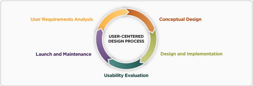
Classic UCD cycle, intended for more than one iteration
Rest assured that when I say design process, I’m referring to a loose, but comprehensive framework that specifically takes into account time and space for strategy and research should you think these phases are essential to your design thinking and decision making down the line.
We’ve all seen these visual descriptions of the user centered design process, yet it boggles the mind when teams habitually ignore the full spectrum of design activities. Omitting them can potentially set you up for failure simply, because you won’t have all the necessary information needed to inform great design decisions. It’s hard to understand indifference to something that seems so important to the product’s success and sometimes you’re left to fight off the feeling that design is not integral, but incidental or somehow marginalized.

Call it what you will: process, phases or flows
Here’s another example of what I mean by a user centered design process in the event that the work scope requires UCD .
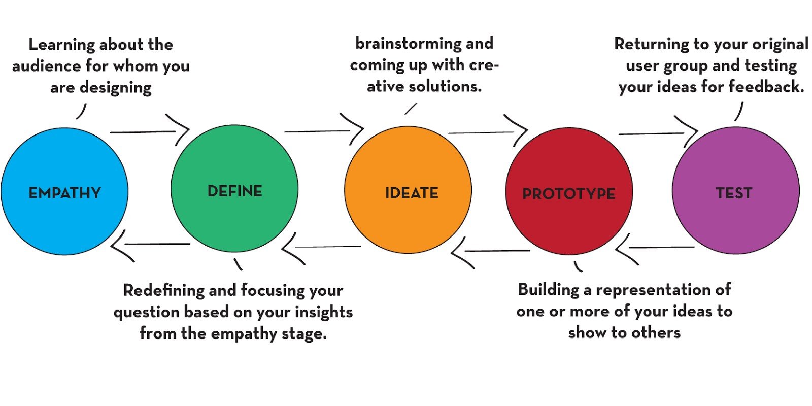
Design is a series of activities. – I forgot who said this
What can the Difficulty and Importance Matrix do for your design culture?
The Difficulty and Importance Matrix is a prioritization tool that can result in an actionable plan. You can identify top ideas and rank them by importance and difficulty. This result can expose an organization's design culture and lead to better design innovation and a more open-mindedness across product teams and beyond.
The Difficulty and Importance Matrix is a useful exercise for prioritizing your team’s ideas and it can readily resolve into an actionable plan. Mel Clarke, designer extraordinaire, walked us through an exercise using the topic of employee benefits and perks in order get a better understanding of how it works.
We first came up with all our ideas by each writing proposed employee benefits on post-it notes. It’s important not to reveal the x and y axis yet, but simply cluster all the post-its and put it to a vote. In this case each person had 5 votes via green, round stickers. This resulted in about a dozen top ideas to work with.
Next we stacked the ideas using only the x-axis, a rank of importance. The y-axis, difficulty, was only revealed after we completed the stacked ranking of importance (x-axis). Next steps were to move each post-it vertically and up into the y-axis to assign its relative difficulty.
The next reveal was adding the dashed lines that defined each quadrant along with their labels: Targeted, High Value, Strategic and Luxury. Another layer of arcs were added for more designated zones. It was at this juncture that it really hit me where I spend most of my time as a designer lately. Unfortunately, it was not so much in the strategic quadrant.
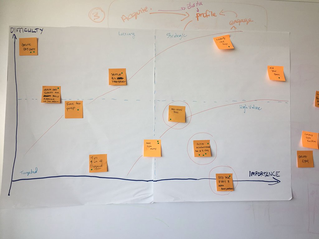
Each quadrant is labeled: Targeted, High Value, Strategic and Luxury
The added value for me beyond a good prioritization tool is a rather stunning correlation between these quadrants of work and Jared Spool’s article on the spectrum of design styles. Spool states that the most skilled teams can flex between all four of these quadrants while having the awareness and maturity to match the appropriate design methodology whether it be Self Design, Activity Based Design through to User Centered Design (UCD).
This image can be quite powerful in exposing an organization’s design culture by simply tabulating how design happens across these quadrants. So for example, if your company spends most of its time in the bottom two quadrants, design is rarely conducted as a strategic piece of work, and most likely UCD never really gets off the ground. Not only could this lead to stagnation in design innovation, but it can also contribute to a narrow minded design culture across the entire company.
References
How to Use Design Thinking Methods to Improve Your Nonprofit’s Strategy and Measurement5 Design Decision Styles. What’s Yours?Collaboration, is it over rated?
Collaboration is a main pillar in the design effort, yet it may not always be helpful. People are inherently complicated if not messy and getting people to work together to solve challenging problems cannot be managed without sensitivity and humility – nuanced thoughts are required to navigate the complex systems of teams.
Collaboration is not always helpful. People are inherently complicated if not messy and getting people to work together to solve challenging problems cannot be managed without sensitivity and humility – nuanced thoughts are required to navigate the complex systems of teams.
The more one is self-aware the less chance the ego will get in the way of a break through. Is being more authentic or maybe even self-actualized a collaboration skill? And if so what happens if collaborators don’t possess this skill or worse yet haven’t a clue that they should at least try to be self aware?
The other thing is where’s the agenda coming from? If you’re collaborating to reach the goal of a customer centered solution, then that collaboration has the potential to solve for those given pain points which could lead to great innovation, big or small. But if the goal of the collaboration is dictated purely by financial models, then collaboration could backfire and fall short of solving actual customer problems.
This collaboration effort can be further undermined by recycling old patterns of behavior that may have brought success at one time, but now the circumstances have changed considerably. Perhaps this team has lost its ability to evolve authentically and is now too afraid of risk. A risk that may not necessarily be financial but rather the unraveling of a comfortable interpersonal dynamic or a familiar way of doing things. So people want to continue to collaborate but with a tight grip, now collaboration is just colleagues hustling to keep everyone informed of all the bad decisions that are being made.
I’ve also recently read that collaborative teams when dissected expose that it can actually be just one person who’s doing all the heavy lifting and the others on the team are just along for the ride. This can result in the burning out of really creative and talented individuals. You’d probably bet that there’s little chance of sustainable innovation in this scenario and what a shame if there’s really such little collaboration actually happening all in the name of this bold, imperative called collaboration.
As with many things we tend to swing the pendulum too far in extremes, yet striking a good balance is often times the best place to be working from. Silos have gotten a bad name and for good reason, but let’s not blindly pin our hopes on what we call ‘collaboration’. Working well together requires specific interpersonal skills and if not facilitated properly can be exhausting and counter productive, especially if there’s an over reliance on just a few contributors and the team isn’t authentically engaged.
Ambiguity can still be helpful in a not so agile environment
I used to work with an agile team that relied heavily on collaboration, so I didn't need to spend much time on UX documentation. But in my current job, I've had to learn how to write design specs. I've found that starting with some ambiguity can actually be helpful, as it draws others into the design process and encourages co-ownership. I've developed a checklist for this less-than-agile environment that includes tasks like creating a rough task list and low-fidelity visualizations. By leaving some gaps for conversations, we're forced into an agile philosophy without even realizing it.
My last gig was way more agile than what I’m navigating at the moment. Previously, my team was highly collaborative (maybe too much so?) wherein I had a continuous stream of conversations with a fearless, entrepreneurial front end developer and a I-don’t-do-work-that-looks-like-crap UI designer which lessened the need for UX documentation in my deliverables.
I was able to spend more of my energy on strategy and intent, and I could produce a more robust framework of problem statements that ignited the rest of the team’s imagination. I also had more space to coach and facilitate the adoption of customer empathy. In some ways it was a dream team and I do miss it. But I don’t want to get into which production philosophy is better, partly because I don’t want to look like I’m making excuses or complaining about the way things are done. I’ve instead gone with a surrender and embrace approach. I’m studying the art of writing a design spec.
Writing design specs is arduous even for those who really like to do it, so one thing to keep in mind is when to actually start spec’ing. Partly because if you start too soon, you’re days are spent updating your spec in reaction to the reality of decision making – things change, you get smarter, your blind spots become more and more painfully obvious, not to mention the twists and turns coming down from VIP stakeholders.
This environment seems like the most inappropriate place for ambiguity, right? Well… it can be a way to get closer to the truth by drawing people into your design process. The draw mechanism is realized by not having it all figured out, leaving some holes, presenting some ambiguity, giving others the opportunity to point out the errors, omissions and oversight.
While ambiguity can be useful in this way, the drawback is that people could make you feel like you didn’t finish or you didn’t think of EVERYTHING – because their frame of mind is less than agile. So your ego might take a hit, but getting others to start filling in the missing gaps is key in this approach. This not only facilitates decision making, but co-ownership is encouraged amongst your stakeholders and peers. Often times they opt in by virtue of their strong opinions and self-expression.
You may feel a twinge of discomfort because you don’t have all the answers. Certain personalities might call attention to the fact that things don’t feel ‘done’, making you feel even more vulnerable, but if you can ultimately land the plane without sinking precious time into spec writing, then in my opinion you’ve accomplished your goal. The goal stated is to spend more time building intent on behalf of the customer’s experience and less time moving pixels around and updating wiki pages.
Here’s my current check list for this particular less than agile environment:
First round: get some general concepts in front of your fellow designers and Product Manager (PM) for feedback which looks like
A rough task list: this is just a quick, almost messy, list of words, phrases and placeholders that convey all the things that the user can do, should do and should not be able to do
Empathy check: collect any existing user research data, quantitative or qualitative; account for user research planning if applicable
Low fidelity visualization: high level, low-fi sketches and visual aides
A straw-man: work out a structure that organizes the design and categorizes the intent of the design (wikis are good for this); include any rough planning for customer engagement or testing
Prepare for mocks: start identifying and collecting patterns, styles, color palettes and font icons, and possibly a plan for the hierarchy of and naming conventions for your mocks
Second round: you now have refined concepts based on the PM’s feedback, but you’ve also consulted engineering for a sanity check and to gauge feasibility
Design as a story: you’ve got a more cohesive design narrative now; you can more or less explain the work to anyone (product, dev, and VIP stakeholders)
Phase 1 mocks: you’re armed with a prototype and story arc that’s available on the wiki
Customer empathy: include any user evidence that can help inform design or product decision making
Third round: shit’s getting real now; refine with a sense of convergence and commitment; your PM, as the final decision maker, should help get things in order so you can start locking things in
Phase 2 mocks: get your design file ready to scale, assign symbols and clean up from your messy exploration
The lagging prototype: usually the prototype can get out of date at this point; while it’s helped you get this far and it’s still an integral reference, the design spec is now taking over as the primary instrument of communication
Fourth round: it’s now time to start writing the design specification, albeit you’ve got alot of the thinking and documentation already in place, but you’ve held off to a point where hopefully the amount of time you spend actually spec’ing i.e. finalizing the thing has lessened
Update the status: remove the ‘Draft UX Design Spec’ tag from the spec, and publish it as ‘done’
Jira ticket: use the Jira ticket going forward to capture any variances, answer questions or add clarity and mostly let the design spec serve as the historical artifact
Because ambiguity leaves gaps in which to have conversations, it forces an agile philosophy without folks even knowing it. Conversations build tribal knowledge and therefore your specs are no longer as integral to the design, they’re lighter and serve only to remind us of what we talked about. Additionally, this standard of documentation is especially important if your organization measures your progress based on the degree in which you’ve documented it. Specs can also be crucial if the team is used to dialing in the design during the QA process.
I’m still learning and adjusting, so let’s see how this works out for me. By the way, as I finish these thoughts Friday evening over my favorite Old Fashioned I see this on the Liquid Bread menu. It seems fitting. Is it possible to gain some grey hairs and lose a few years at the same time?
You’re only as young as the last time you changed your mind.
– Liquid Bread bar menu
Research and design for customer collaboration — building a framework of evidence for the MVP
In my article, I discuss how I designed an affinity diagram to map human collaboration behavior using the end to end customer the journey, collaborating with our UX Researcher to identify key archetypes and personas that drove collaboration features for our customers. I also explored how other sites facilitated collaboration and used these findings to inform my design process.
Collaboration as a human behavior is intricate and vast. As such my approach was to capture the current collaboration experience in addition to exploring future user scenarios and use cases. I designed an affinity diagram as a navigable map to establish coordinates to identify steps in the survey experience and what collaborative behavior might be taking place at various points in the journey.
The color coded tags represent internal and external evidence spanning both existing customer pain points and customer requests. The map shows a denser population around communication and boundaries – in the earlier part of the journey when setting up and designing the survey – this provided an evidential narrative for options such as commenting and permissions.

Collaboration moments map
I collaborated with our UX Researcher who led a usability study
Our UX Researcher and I set out to get a better understanding of how people collaborated when working on a survey. What features did they use within the SM core platform to collaborate, and what would best assist them in their future collaboration behavior. Main collaboration moments where identified as well as key archetypes and personas that then drove the relevant collaboration features that would add the most value to our customers.
Further exploration resulted in discussions around our pricing model and whether offering a bundled or packaged option would benefit those who simply wanted to share parts of the survey journey with their stakeholders – stakeholders who were not necessarily interested in being actual survey creators themselves.
Archetypes as personas for Collaboration

Features by archetype
I synthesized these design personas and they were astonishingly helpful for identifying possible product features that would be relevant and helpful.

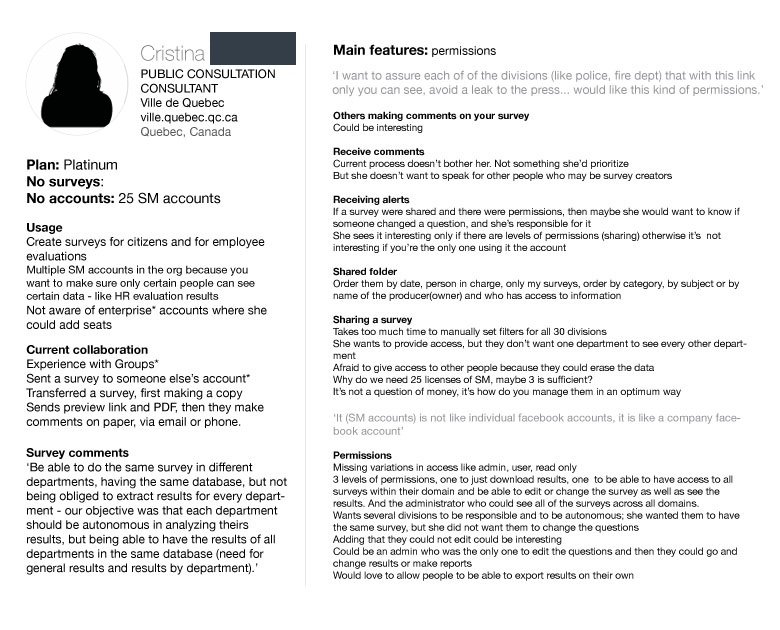


Desk research for collaboration patterns
I took a look at how other aspirational and comparable sites where facilitating collaboration like Google, Zeplin, Evernote, InVision as part of my design process to feed the incubation phase . Here’s how I captured collaboration in Dropbox as just one example.

Conceptual sketches for sharing in Dropbox

Conceptual sketches for collaboration in Dropbox
Outcome and next steps
Once these future collaboration features (sharing alert notifications, granular permissions, commenting and bundled packaging) were prioritized, they were delegated across the wider company and assigned to various product teams and their product area roadmaps for the coming year (2016/17). I continued with concept designs for collaborating with teams and sharing response alert notifications, as well as completing granular permissions as lead UX Designer for Analyze.
Question ‘The Ping’, from The Accidental Creative
In this article, I emphasize the significance of focus in the creative process and introduce the "Ping" concept, which can hinder creativity by diverting attention. I encourage readers to embrace discomfort and resist short-term distractions, as it can lead to a creative breakthrough.
There’s a chapter in the The Accidental Creative by Todd Henry that talks about focus as part of the creative rhythm and he begins with the things that can be distracting when we’re working towards creative solutions.
‘The Ping’ as he describes it is the tendency to alleviate boredom or tension by engaging with email or social media to escape a deep focus via a quick boost of dopamine. Consider that this tension could be an inherent part of the creative process and that dealing with this tension is a skill in and of itself.
We’re not doing ourselves any favors then by relieving that tension. That’s the uncomfortable energy we so desperately need to get us to an illuminating state of mind. These distractions could be strangling our muse and upsetting our creative rhythms, are you sure you want to do that?
John Cleese brings this up in one of his talks on creativity where he describes what he calls the ‘open mode’, a state of mind that promises to allow our natural creativity to flow. In order to get into the open mode, you have to escape the closed mode first and the way you do that is to allow yourself an ‘oasis’ of time and space with no distractions.
Yet if you’re fortunate enough to catch a creative wave, you can end up with a nagging, uneasy feeling. This is actually the early stages of your solution, all balled up and full of potential, but not yet formed. At this stage things feel unresolved and you might also be dreading that the good ideas will never come. In fact it’s in your best interest to sit with this tension for awhile in order to see things through.
Why the discomfort? One way to look at it is that our minds are very adept at closing the loop to find the quickest solution to a problem based on the data it has accumulated from the past. We feel confident when we think we’ve arrived at the best solution and from an evolutionary stand point, this behavior keeps us alive. But you might be riding high on false assumptions and the desired solution might not have anything to do with the past, especially if you want to come up with something new.
Your efficiency and impulse to feel smart has caused you to miss out on emergent and perhaps innovative opportunities. If you’re after something better, you might have to fight this instinct to feel better sooner in favor of enduring the uncertainty for a little bit longer.
When you allow your attention to be fragmented, you run the risk of losing that tension that Cleese states is inherent in the open mode way of thinking. In additional, you’ll probably incur a switching cost when your attention ping-pongs from one task to the next – another probable drain which could tax your energy to maintain the focus you want.
‘If something makes you feel a little nervous just thinking about it, this means you’re probably on the right track.’
– Todd Henry, The Accidental Creative
Being uncomfortable can suggest you’re moving past the status quo. Henry goes on to point out that sitting with that tension can be thought of as a ticket to a creative breakthrough or at least a ride to experience that creative flow. So it’s critical to hold on to that tension and resist the short term gratification or distraction which is always never far away in the form of the internet or a laundry list.
So the next time you’re feeling anxious and a little bit uncomfortable about a problem, instead of playing it safe maybe you should stick with it as long as you can and consider yourself lucky to be on the road to other possibilities and potentially better solutions.
Choosing the appropriate design style for your project
In this article, I explore different design styles, including unintended design, self design, genius design, activity-focused design, and user-focused design (UCD). Jared Spool suggests that a strong design culture requires teams to choose the applicable style and have the expertise to execute it well. I emphasize that the ability to quickly switch between styles can result in the best experiences. While UCD is essential for an excellent overall experience, it's crucial to recognize what part of the design spectrum a team is working in to avoid confusion and missteps. By understanding the different design styles, I hope to help readers choose the most appropriate design style for their projects and ultimately create excellent user experiences.
Take a look at these various design styles and before you default to user centered design (UCD) as a sort of pavlovian reaction, consider Spool’s point that good teams implement all of these depending upon the circumstances. A team’s ability to choose which one of these styles is applicable and then have the capacity and expertise to execute within that style may be the more interested test of a strong design culture.
The teams that produced the best experiences knew these styles well and how to quickly switch between them. – Jared Spool
Decision Style #1: Unintended Design
Essentially this is no design because the team is focused on development and deployment. It’s a game of chance. With some luck it could turn out okay.
Decision Style #2: Self Design
Teams using this style are basically designing for themselves. This will only work well if the team members are the actual users of the product.
Decision Style #3: Genius Design
Spool coins this one as the Seen-It-All Design. But the caveat here is the you’ve not only designed something many times over, but you’ve done all the in-depth research to back up your decisions as well.
Decision Style #4: Activity-Focused Design
In this case the team already know what they’re going to build and so they study how users will interact with the features they intend to release.
Decision Style #5: User-Focused Design
Also referred to as user centered design (UCD), this style requires the most research and goes into far more depth than simply feature interaction design. Instead you start to frame the entire problem space by determining the needs of your customer by studying their behavior within a context and their environment.
This design style (User-Focused Design) is the high-end approach and is necessary if the team is looking to create an excellent experience overall. – Spool
So the question is not whether your organization is committed to best practices in UCD, it’s whether the company as a whole knows how to differentiate and respond well to the spectrum of design approaches. The ability to recognize what part of the spectrum we’re designing in can also dispel any missteps, like confusing activity-focused design (style 4) with user-focused design (style 5).
REF| https://articles.uie.com/five_design_decision_styles/