An obligation to ship
In this article, I discuss my experience of joining a team that was already working with a set of interactive wireframes for a product. As I took over the Axure RP file, I discovered that the wireframes were designed beyond what was possible to build in a reasonable time frame. We were drowning in heaps of design assumptions that had not yet been validated, and I had to de-scope towards a minimum viable product (MVP) and make the right design decisions that brought the most value to the customer. Seth Godin's work on resistance helped me understand the importance of shipping, even when facing constraints.
Sometimes you are in a position where you’re simply obligated to ship something. And when shipping becomes the most important thing for a team, it sets a very specific dynamic in the decision making process where you are constantly negotiating about how much design debt you are willing to take on order to get something out there asap.
I recently had the opportunity to join a fantastic team of really talented people who had already been working with a set of interactive wireframes, or a rapid prototype (RP) as Axure calls it, for quite some time. I was so stoked to start taking over the Axure RP file as it was created with significant amounts of logic coded to render alot of sophisticated interactions that quite frankly projects usually don’t have much time for. I was in Axure RP heaven.
But things that seem too good are rarely that. I started to uncover a problem and after asking naively and repeatedly for the latest coded build to accompany these wireframed beauties, things turned a corner. Not only was the code not in sync with the wireframes, but the wireframes were designed way beyond what was going to be possible to build in any reasonable time frame. This gorgeous RP file was now fast becoming a waterfall behemoth and although it was doing a hell of a job selling to stakeholders, it was months and months ahead of a real live product.
It felt like we were drowning in heaps of design assumptions that had not yet been validated. My heart sank as now I was not going to be designing, I was going to have to un-design. Instead of building on these Cadillac wireframes, I was going to have to start stripping them back towards something more like a Ford Focus. In short, my job was now to ship!
As we de-scope further and further towards a minimum viable product (MVP), we strive towards making the right design decisions that bring the most value to the customer. The product itself and the team have come together in a more profound way since we started working on Lean UX principles.
Seth Godin’s work on resistance from his book, Linchpin, has certainly done well to provide some insight into this predicament. His talks and article, Seth's Blog: Quieting the Lizard Brain, have really helped to explain a bit about what’s going on when one of the most critical constraints on a design is that you simply have to ship it.
Design spikes for agile
As a UX practitioner, I often face the challenge of designing holistically when my team is focused on a small set of features within a limited scope. It's like trying to build a car one part at a time, without considering how all the pieces fit together. Recently, I came across an article by Damon Dimmick on Smashing Magazine that proposed a solution to this problem called the 'Design Spike'.
UX Practitioners seem to have considerable challenges designing holistically when the team focuses on a short list of feature sets within a small scope. It’s like trying to design a car by working out each part of an automobile in isolation, the steering wheel, then the roof, the back seats, etc… What this mentally conjures up is a funky, perhaps even awkward multi-colored sculpture comprised of bolted on parts and probably not the nicest looking car on the lot.
So browsing through Smashing Magazine the other day ended up proving fortuitous as I read Damon Dimmick’s article which suggests an approach to managing this very problem. He calls it the ‘Design Spike’. Ref article link below.
Coincidentally, I was presented with a situation that sort of matched this issue. While the development team was gaining ground on coding the front and back-end parts, the visual design was not getting the right kind of attention. So we all agreed to embark on a design spike sprint (try and say that 5 times really fast).
The challenge of trying to inject UX Design into quick agile development iterations seemed to be eased by this approach. It’s something to add into the UX toolbox of possible activities that can get design back up on its feet especially if it’s been neglected for too long.
Ref | http://uxdesign.smashingmagazine.com/2012/11/06/design-spikes-fit-big-picture-ux-agile-development/
Are your UX walls working hard enough?
Working walls, a large surface on which ideas, data, and work can be displayed, rearranged and extended, can provide an external view of the design process, support agility in design thinking, and serve as scaffolding to amplify the talents of others. Working walls can result in better design solutions by making the design process more transparent and arguing from a bigger vantage point.
There’s nothing new about putting all your stuff up on a wall to try to figure out the bigger picture of a design. We often do this instinctively without really knowing why. Last month Laura Busche wrote an article for Smashing Magazine called, Up On The Wall: How Working Walls Unlock Creative Insight, which went to the trouble of listing out some of the reasons why working walls can be so powerful. And in the process it appears she’s coined the phrase, working walls, which at least in my mind gives this technique more weight as a proper UX design activity.
Busche defines a working wall as a large vertical surface on which ideas, data, and work in progress can be displayed, rearranged and extended. A working wall externalizes your work and can empower different types of design thinking whether it be divergent or convergent, critical or sparking, and most important to me lately is that working walls can support an holistic view of your design; a map of the world (MotW) so to speak. MotWs can lead to breakthroughs because you can easily rearrange concepts at any scale.
The scale at which you design a MotW should allow you to zoom in and frame a section at a time. If it’s been designed BIG, you’ll also be able to step back and view the design holistically, ideally surveying your design as a system of interconnected pieces. This technique supports agility in your designing thinking so that you can avoid making bad decisions because you’re trapped in a myopic viewport. Often times we’re designing way up too close and it’s difficult to ensure that we’re not adding complexity or designing in additional patterns that would otherwise be challenged in the holistic view.
A working wall can also provide a physical space to co-create with your peers. Design becomes more inclusive in this environment so others have the opportunity to contribute their thoughts and ideas. Your team can build up and support conceptual mental models together. You can capture reactions and focus them back onto the wall which helps you learn effectively. The walls work in your favor if you can steer the feedback constructively back onto them, which takes the pressure off you especially if the conversation is heated. Getting peoples’ controversial opinions out and onto the walls, even just by making a notation with the proverbial red pen, allows you to take everything into account whilst keeping defensiveness or hurt feelings at bay.
Working walls can also serve as scaffolding to support and amplify the talents of others. Sometimes it’s more of a matter of framing the problem statement to then jumpstart a riffing session of ideas between the entire team. Walls with added contextual information provide a rich narrative of what we’re trying to solve and getting everyone in front of that wall can get all our minds collectively honed in on exactly what the issue is.
Ideally you set the stage, create an atmosphere and observe how others can find their wings. Hopefully, you all lift off and take flight at the same time. Now all you have to do is react to and leverage from each others ideas. By amplifying the talents of others, in a focused manner, you can achieve a sort of resonance, similar to how an improvisational jazz ensemble might innovate through a song together.
Working walls can no doubt help to improve design. They give you the opportunity to deliberate with all the relevant information in a strategic manner. You can take into account a zoomed in and a zoomed out view allowing your design thinking to shift from micro to macro (and back again) more readily. Working walls help you to maintain consistency of visual elements or UI/UX patterns across the site.
You can also address strategic work such as user testing more readily by referencing the bigger picture in a MotW. Working walls can result in a deeper understanding of a problem by refreshing the wall each time you iterate; the more design iterations you go through, the better chance you have of reaching a more profound simplicity in your design.
And finally, by using the walls as a physical container in which to bring the team together, you can facilitate more intense dialogue which although painful at times, can result in better design because you’ve taken on board and sifted through everyone’s thoughts and opinions. By making the design process more transparent and arguing your points and assumptions from a bigger vantage point you can end up with a much more solid and influential platform from which to negotiate your design solutions into the wider team.
It’s high season for workshops
For some time now, our UX team has been evangelizing the importance of driving projects based on an understanding of how users intend to use the products we’re designing for.
For some time now, our UX team has been evangelizing the importance of driving projects based on an understanding of how users intend to use the products we’re designing for.
The workshop can be a productive way to bring stakeholders together to build closer relationships with personas, identify customer pain points, and explore deeper and more profound solutions to address their users’ needs.
Often times, it’s the first time a team has sat together for an extended period of time to properly discuss the project beyond just the token, and most probably, poorly written project brief. The workshop can be designed to bring people who are working on the project closer aligned to their customer requirements. On top of this, there’s usually an element of group bonding that can occur when sharing thoughts and ideas during catered lunch and coffee breaks, especially if it’s over an extended time away from our day-to-day routines.
Good, if not text book, so far. However, we went from pleading for the inclusion of UX workshops and having to appease upper management’s political concerns of fear of exposure, to an onslaught of management requests to engage prospective clients using the workshop as a pre-sale tool. Once it became clear that you could land paying clients with a UX workshop, the flood gates opened up with incessant demand for them. I was not prepared for the series of parades that followed. I recall my discomfort at the expectation that we report back with deal closing talk vs. a deeper understanding of our personas’ pain points.
I recall the worst was showing up to host a workshop only to feel the table turning in favor of a high level executive who was running the entire loyalty reward scheme at the time. The political schema was palpable as I watched my workshop quickly being reduced to just a pawn in his game to categorically refuse any involvement with eCommerce. It did not matter how users might better interact with the site, what was clear was they there would be absolutely no involvement with that other division that competed with his place and stature within this behemoth organization. I lost that day, but I learned alot about the protective nature of power.
Sometimes, though, you get lucky and land in with someone exceptional who really gets the purpose of a workshop. I’m thinking of David Viqueira in particular who was IT Business Relationship Manager at the time and needed some help guiding his client through various improvements to an antiquated CRM application. My favorite moments are when everyone is fighting for the pen which is my cue to start taking a few steps back to allow the team to express themselves and discover their own flow. After all, most likely they are the experts and in moments like these it’s clear that I’m merely the facilitator, especially if the energy is with someone else who’s clearly leading the direction and doing it well.
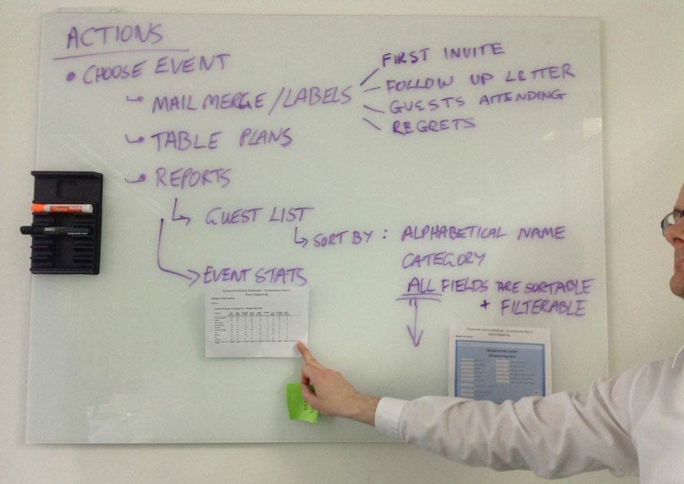
Our internal client presented us with endless pages of a tired ol’ invitation application
I kicked us off by steering the conversation towards the actual journey
I started sketching the ideas that were now coming fast
The energy was fun and engaging as we organized a wall of our ideas
Lately, workshops for me are more about being aware of the energy in a room; being able to swiftly identify and nurture those who are the resonators, and lifting an eyebrow at those who insist on collapsing everything.
But also it’s recognizing that in some cases it’s not even about customer behavior, it’s about learning how to stand aghast at the actual client behavior without losing a beat as the customer advocate.
Workshop for a geolocation app
A proper UX workshop got us the personas we needed to kickoff a project designing a native app as part of a wider digital ecosystem of content and media.
Approach to the digital ecosystem of media and content
We managed to get a massive 4 hours for a UX workshop for a close-knit team who’s looking to add an app to their existing digital portfolio already consisting of a website and an html5 mobile version.
In preparation for the workshop a quick set of slides were created to establish that since these other sites already existed, this app can be uniquely positioned as a niche application as local recommendations for news, businesses and other services. It was also key to present an info graphic on the difference nuances of using geolocation as a display of locations within a radius vs. receiving a notification when a device is in a location’s hot spot. Our lead mobile architect helped us coin this as the Pull vs. Push approach to leveraging native geolocation functionality.
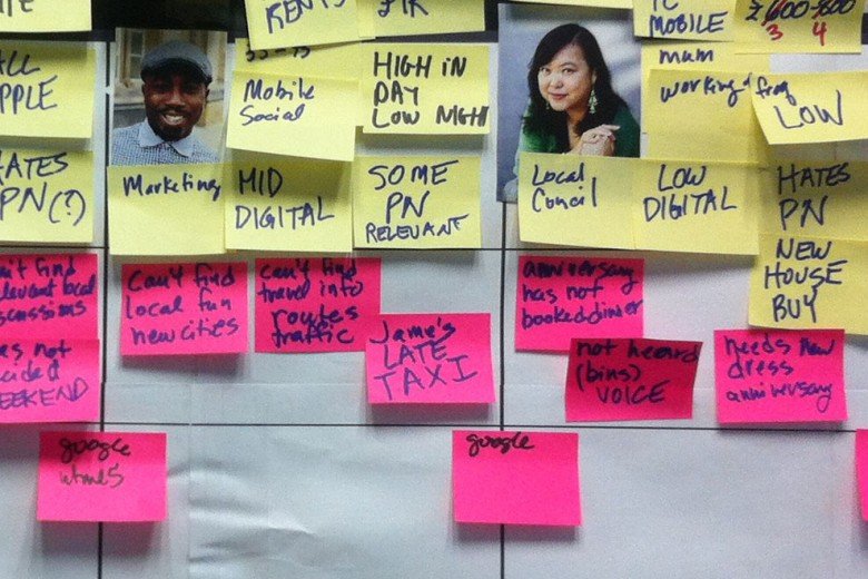
The workshop itself comprised of creating personas that ranged in attributes from hating push notifications to not minding them as long as personalized settings were available. We then went through a process of stating pain points for each persona along with ‘out of the box’ solutions which finally culminated in forcing everyone to state there assumptions using a strict sentence structure, an elevator pitch, such as
This [product] solves the [problem] because of these [reasons].
or
[Persona] will use this [product] above [competitor product] because it does [this function].
Persona building, a critical part of the empathy piece in a workshop
We took a break for lunch which was catered in and this gave us some time to relax, but we also spent some time discussing the morning’s work in a more casual manner, especially since it was all over the walls.
In retrospect, I think this was helpful to the creative process which we definitely needed during the second half where we embarked on coming up with as many risks as we could think of including obtuse things like, ‘people won’t download the app.’ The minimum viable product (MVP) was around the corner by weighing the risks column against the assumptions column to formulate the core features of the native app.
I should give a shout out to my BFF BA, Maria Axente, who promptly piped all the information into a beautiful requirements document which outlined the half day’s work and organized the feature set as the core minimum success criteria and then additional layers of features which could be added in a modular sense given the time and budget. Everyone expressed their gratitude including myself as our 4 hour workshop set a good momentum for the rest of UX activities to follow.
Guerrilla user testing
Guerrilla user testing yielded some results that we would’ve anticipated, but there were also some surprises which again reinforces how crucial user testing is early in the project.
A couple of us UX peeps decided to embark on a trial run of guerrilla user testing as a side project.
After sending out a mass email and coordinating the space, we spent a full part of a day welcoming various folks into our pop-up user testing ‘lab’ to give us their feedback using one of our beta responsive sites.
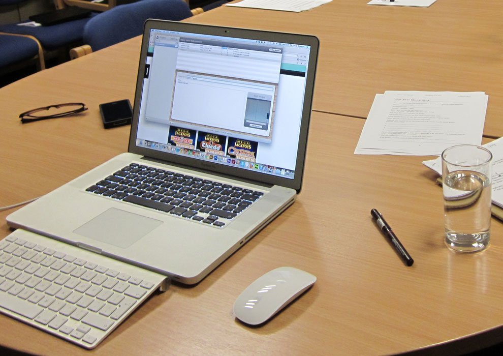
We used Clearleft’s Silverback App to video tape the users on both desktop and a mobile device. All the hard work really paid off as we were amazed at the amount of rich information we captured even in a guerrilla scoped approach.
Silverback video testing software provided ample evidence of user behavior
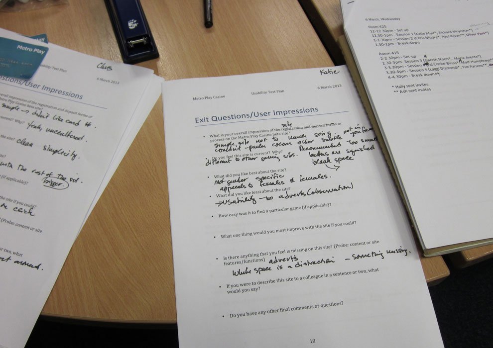
Capturing feedback from internal users removed from the project
We were able to detect patterns of specific usability issues uniquely for both desktop and mobile.
Some results we would’ve anticipated, but there were also some surprises which again reinforces how crucial user testing is early in the project.
Various results were adopted almost immediately for the next sprint iterations.
A day in the life of your customer
You tend to forget how important it is to at least show up at these Meetups. After a crappy day slinging pixels, I forced myself over to Google Campus… hungry, glum… and the UX Cafe turned it all around with some amazing speakers, but in particular Vicky Cullen’s quick preso on a UX activity that focuses on following a user through their entire day was super inspiring.
Here’s her slideshow, so you can get a better idea of the sketches she presented on that evening.
The next day, my fabulously talented colleague, Andrea Prieto, remarked that she was also in the audience the night before (yes, how did I miss that?) and really loved Vicky’s approach to capturing not just a user journey for a product session, but for the entire day.
Andrea had us all journal our day over 24 hours
This inspiration set off a series of planning sessions where Andrea led one of the most amazing workshops I’ve ever seen.
This also included the production run of a small personal diary that was given to each attendee a week prior to the day of the workshop with instructions to load it up with details of ‘a day in the life of your customer’.
It’s another reminder that there’s such talented people all around you – so pay attention and always show up!
Designing for a living system: how to create digital products that evolve
Designing digital products today requires a constant awareness of the rapid changes in the digital landscape. With the emergence of the Internet of Things, designers must create living systems that adapt to the ever-changing digital world. To achieve this, designers need to create intuitive, natural interfaces that minimize disruption and prioritize user experience. By focusing on user behaviors and patterns, designers can create products that feel like a natural extension of our digital lives, rather than outdated metaphors.
The digital world is constantly evolving, and given the rate at which our content is changing every day, minute, or second, digital products are now considered living systems. Especially with the emergence of what’s referred to as the Internet of Things where everything around us could talk to the internet. A product that moves a user through a single flow or experience may not be enough to address the vast scope of how we will interact with future environments.
In order to create a more natural and supportive interface, designers need to consider how users interact with multiple devices and how to minimize disruptions to their attention. This could involve the use of voice commands, haptic feedback, and removing unnecessary buttons or clutter. The goal is to create a seamless user experience that feels intuitive and easy to use.
Designers should also be mindful of the importance of patterns in achieving desired outcomes. Blaise Agüera y Arcas’ gives the deceivingly simple statement ‘It’s about What Are You Trying to Do?’ Hell’s ya and exactly! We’re probably in a phase right now where we don’t quite have the human/machine balance quite figured out yet.
Our fragmented attention split between people and devices is probably more disrupting than enabling our conversations. We may start to embrace a more natural and supportive interface that runs in the background and doesn’t nag so much or demand so much of our direct attention. As we grow tired of this inefficiency, we may start to appreciate things like the use of voice, removal of buttons, or even more natural human gesturing like haptics which will give us tactile feedback upon touching a screen in the form of a subtle vibration on the fingertip.
Additional commentary that sings to our future is that it’s more about the content and less about the chrome. The ‘chrome’ is what now seems to be old-fashioned visual metaphors translated onto the screen. The chrome is just the signal for the metaphor being used, the content is what’s real.
A truly innovative design would evolve directly from the native digital world instead of importing the idea of turning a glossy magazine page via a time-based animation to make it look like you’re turning a real page. The idea of translating traditional print and other analog metaphors into design is considered derivative and actually missing the point of our digital medium.
In conclusion, designing digital products requires a deep understanding of user behaviors and patterns. By creating a seamless and intuitive user experience, designers can create products that feel like a natural extension of our digital lives. By embracing the unique qualities of digital design and moving away from old-fashioned visual metaphors, designers can create products that feel truly innovative and groundbreaking.
Iteration is key to Google’s design approach
The blog post discusses the major redesign of Google's products in 2011, which was engineered by CEO Larry Page. The redesign aimed to create a more cohesive and visually appealing user experience across all of Google's products, including search, Gmail, and Google+. This effort was seen as a response to competition from Apple and other companies and helped to position Google as a leader in design and user experience.
We’re not just inventing digital products, we’re also in a pinch to invent new ways of working in order to adjust our approach to this revolutionary new age.
In 2011, Google went through a massive redesign under the leadership of its co-founder Larry Page. The redesign was a result of efforts to improve the user experience and make Google a more visually appealing and intuitive platform. In this blog post, we'll explore the details of how design leadership engineered this beautiful revolution at Google.
The vision was to create a more unified and consistent design language across all of Google's products. The redesign effort was not just about making Google look better, but also about making it more intuitive and user-friendly. Page's goal was to create a seamless user experience that would help users find what they're looking for quickly and easily.
To achieve this, Page brought in a team of designers and developers who worked on a new design language called "Google Material Design." This design language is based on the principles of real-world materials and objects, such as paper, ink, and shadows. It is also focused on creating a sense of depth and dimensionality in the user interface.
One of the key aspects of the redesign effort was to make Google's products more consistent in terms of their design language. This involved creating a set of design guidelines that would help ensure that all of Google's products followed the same design principles. This was important because it allowed users to move seamlessly between different Google products without experiencing jarring visual differences.
Another key aspect of the redesign was the focus on simplicity. Page wanted Google's products to be simple and easy to use. This meant getting rid of clutter and unnecessary features and focusing on what was essential. This approach helped to make Google's products more intuitive and user-friendly.
The redesign effort was also driven by a focus on speed. Page wanted Google's products to be fast and responsive. This meant reducing page load times and making sure that Google's products worked well on mobile devices.
Overall, redesign efforts were a massive success. The new design language and design guidelines have helped to create a more consistent and intuitive user experience across all of Google's products. The focus on simplicity and speed has also helped to make Google's products more user-friendly and accessible.
In conclusion, redesign efforts at Google were focused on creating a more unified, consistent, and user-friendly design language across all of Google's products. The focus on simplicity, speed, and intuitive design has helped to create a beautiful revolution at Google that has improved the user experience for millions of users worldwide.
More stuff to read on this topic at http://www.theverge.com/2013/1/24/3904134/google-redesign-how-larry-page-engineered-beautiful-revolution

