Designing ways to understand quiz results

Quizzes had been the top most requested feature for a number of years. The initial launch resulted in high usage and high customer satisfaction. Top use cases are corporate training, employee engagement, certification, customer engagement, and education.
As an example, a corporate trainer is now be able to automatically grade multiple associates’ quizzes and provide instant feedback. This feature also resulted in higher retention and conversion.
Process
As in most cases, I started the design process with a white board session with my PM to begin visualizing the requirements and use cases.

Discussing chart options for the best data visualization
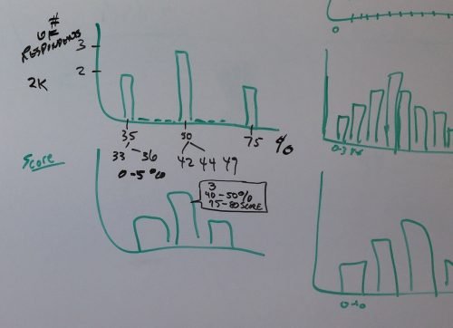
Histogram chart, ranges of quiz scores

Summary stats and infographics
I then created a mid fidelity prototype for the Analyze Quiz experience that was used to conduct user testing and which helped us improve primarily the information experience and copy text, as the overall UX design was validated by the tests.

Our UX researcher conducted user testing for Quizzes on both the Create and Analyze areas of the application
Outcome
Final designs were delivered via InVision flows, high fidelity mocks and design specs in Sketch. I have since refreshed the Analyze experience as part of the 2017 SM re-branding effort which was completed in July as seen below.
Question Summary
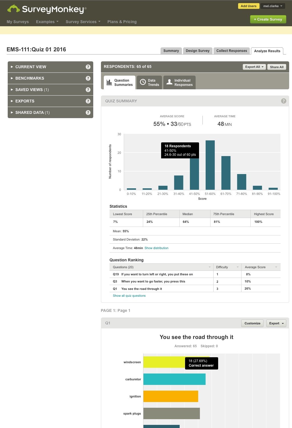
Before Brand Refresh

After Brand Refresh
Individual Responses
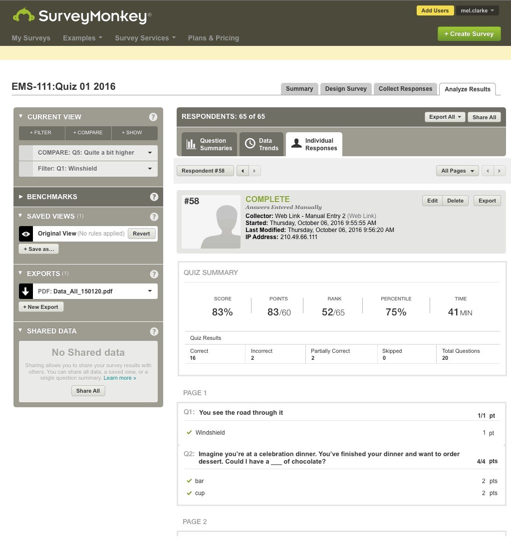
Before Brand Refresh

After Brand Refresh
I also did the mobile designs for both the summary card on the home screen and the details screen shown here.
Note this was before the 2017 brand refresh efforts so it’s not as pretty.

A quiz card for the home screen

Quiz summary and question stats in Analyze