Selecting from various product types in the M4B app

A cross-functional workshop with project management, product, engineering, research, design, QA and customer success
Role: Lead UX Designer for MOO for Business
Project: Large Format Products
Company: MOO
Context
Once our M4B, MOO for Business, MVP was validated, we set out to make large format print products like letterheads and flyers available to our users who were clamoring for this enhancement.
Process
I led two separate workshops where we first looked at how a user might go about selecting a template given that they would now have several product categories to choose from instead of just business cards.
The second workshop focused on how to customize your product once selected which would entail the re-design of the actual builder as it now needed to accommodate the creation flow for multiple products with varying sizes.
I applied best practices in workshops by providing a participant kit for each attendee which included things like personas, user stories and conceptual framing in order to get the best out of our creative time together.
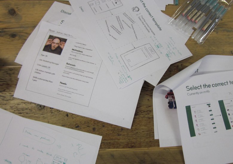
Personas, user stories and conceptual diagrams as scaffolding to spark idea generation
I leveraged the Design Studio Method which uses an approach that’s coined “diverge & converge”. Separate teams go through a diverge cycle early on in the workshop after which all teams come together to converge as one full group to do a final iteration based on what they’ve learned throughout the process. A key activity in this workshop method is that each team must pitch their idea to the rest of the group thus bringing awareness and cross pollination of ideas to everyone.

A team pitches their sketched idea early on in the workshop
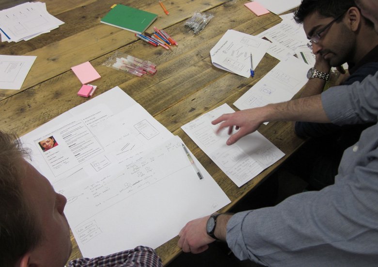
The PM is getting excited and is already talking to the engineers
I quickly whipped up a prototype based on the outcome of the first 1/2 day session for selecting a product, which I then used in a series of user testing with our customers.
We looked at two different approaches to selecting a product template. One was more of a browsing experience where you could select your product templates from a grid.
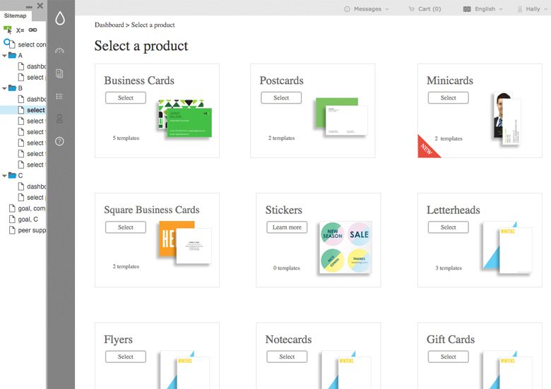
The prototype with a grid for browsing product types was found more attractive by customers
The other idea was a series of category tabs with a filtered list of templates to choose from.
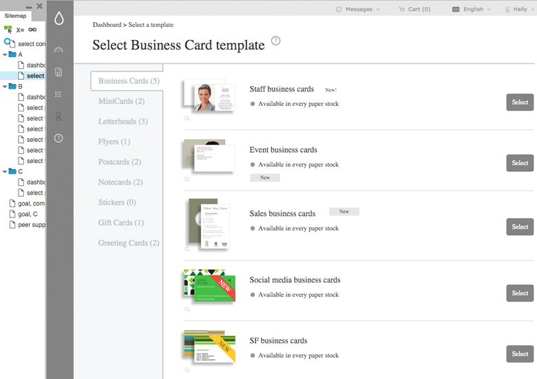
The prototype with left hand category tab navigation and a filtered list was preferred overall
Most said that while they liked the visual aspect of the browsing option, the tabbed category lists allowed them to make a selection more quickly. So there was a clear preference for efficiency and speed over the visual aspect of the grid.