Workshop for a geolocation app
Approach to the digital ecosystem of media and content
We managed to get a massive 4 hours for a UX workshop for a close-knit team who’s looking to add an app to their existing digital portfolio already consisting of a website and an html5 mobile version.
In preparation for the workshop a quick set of slides were created to establish that since these other sites already existed, this app can be uniquely positioned as a niche application as local recommendations for news, businesses and other services. It was also key to present an info graphic on the difference nuances of using geolocation as a display of locations within a radius vs. receiving a notification when a device is in a location’s hot spot. Our lead mobile architect helped us coin this as the Pull vs. Push approach to leveraging native geolocation functionality.
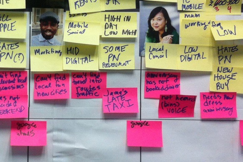
The workshop itself comprised of creating personas that ranged in attributes from hating push notifications to not minding them as long as personalized settings were available. We then went through a process of stating pain points for each persona along with ‘out of the box’ solutions which finally culminated in forcing everyone to state there assumptions using a strict sentence structure, an elevator pitch, such as
This [product] solves the [problem] because of these [reasons].
or
[Persona] will use this [product] above [competitor product] because it does [this function].
Persona building, a critical part of the empathy piece in a workshop
We took a break for lunch which was catered in and this gave us some time to relax, but we also spent some time discussing the morning’s work in a more casual manner, especially since it was all over the walls.
In retrospect, I think this was helpful to the creative process which we definitely needed during the second half where we embarked on coming up with as many risks as we could think of including obtuse things like, ‘people won’t download the app.’ The minimum viable product (MVP) was around the corner by weighing the risks column against the assumptions column to formulate the core features of the native app.
I should give a shout out to my BFF BA, Maria Axente, who promptly piped all the information into a beautiful requirements document which outlined the half day’s work and organized the feature set as the core minimum success criteria and then additional layers of features which could be added in a modular sense given the time and budget. Everyone expressed their gratitude including myself as our 4 hour workshop set a good momentum for the rest of UX activities to follow.

