Research and design for customer collaboration — building a framework of evidence for the MVP
Collaboration as a human behavior is intricate and vast. As such my approach was to capture the current collaboration experience in addition to exploring future user scenarios and use cases. I designed an affinity diagram as a navigable map to establish coordinates to identify steps in the survey experience and what collaborative behavior might be taking place at various points in the journey.
The color coded tags represent internal and external evidence spanning both existing customer pain points and customer requests. The map shows a denser population around communication and boundaries – in the earlier part of the journey when setting up and designing the survey – this provided an evidential narrative for options such as commenting and permissions.
Collaboration moments map
I collaborated with our UX Researcher who led a usability study
Our UX Researcher and I set out to get a better understanding of how people collaborated when working on a survey. What features did they use within the SM core platform to collaborate, and what would best assist them in their future collaboration behavior. Main collaboration moments where identified as well as key archetypes and personas that then drove the relevant collaboration features that would add the most value to our customers.
Further exploration resulted in discussions around our pricing model and whether offering a bundled or packaged option would benefit those who simply wanted to share parts of the survey journey with their stakeholders – stakeholders who were not necessarily interested in being actual survey creators themselves.
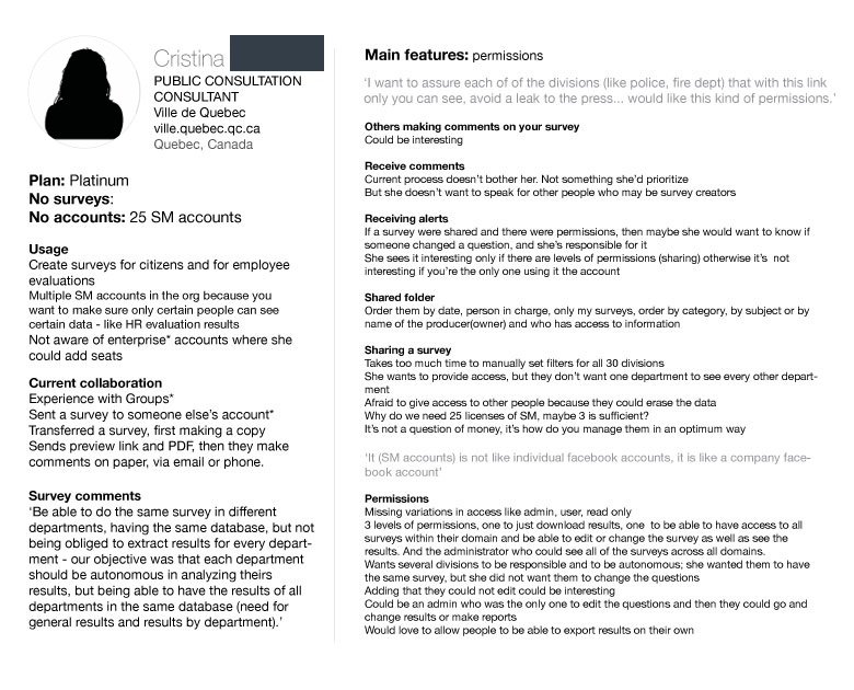
Archetypes as personas for Collaboration
Features by archetype
I synthesized these design personas and they were astonishingly helpful for identifying possible product features that would be relevant and helpful.
Desk research for collaboration patterns
I took a look at how other aspirational and comparable sites where facilitating collaboration like Google, Zeplin, Evernote, InVision as part of my design process to feed the incubation phase . Here’s how I captured collaboration in Dropbox as just one example.
Conceptual sketches for sharing in Dropbox
Conceptual sketches for collaboration in Dropbox
Outcome and next steps
Once these future collaboration features (sharing alert notifications, granular permissions, commenting and bundled packaging) were prioritized, they were delegated across the wider company and assigned to various product teams and their product area roadmaps for the coming year (2016/17). I continued with concept designs for collaborating with teams and sharing response alert notifications, as well as completing granular permissions as lead UX Designer for Analyze.


